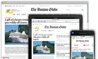
Bostonglobe.com

Remember responsive design from last semester — the combination of percentage-based layout, scalable images, and media queries that lets pages adapt fluidly to the browser/device width?
Yesterday a new Boston Globe website was launched “for all devices”. I think it’s probably the largest responsive website designed to date. It was created primarily by design studio Upstatement and the developer shop Filament Group, with help from Ethan Marcotte, the designer/developer largely responsible for the term and many of the ideas behind “responsive web design.”
Check out the blog posts from Upstatement, Filament Group, and Ethan Marcotte.