Watkins Web 2: Blog

Welcome to Web 2

Hi everyone,

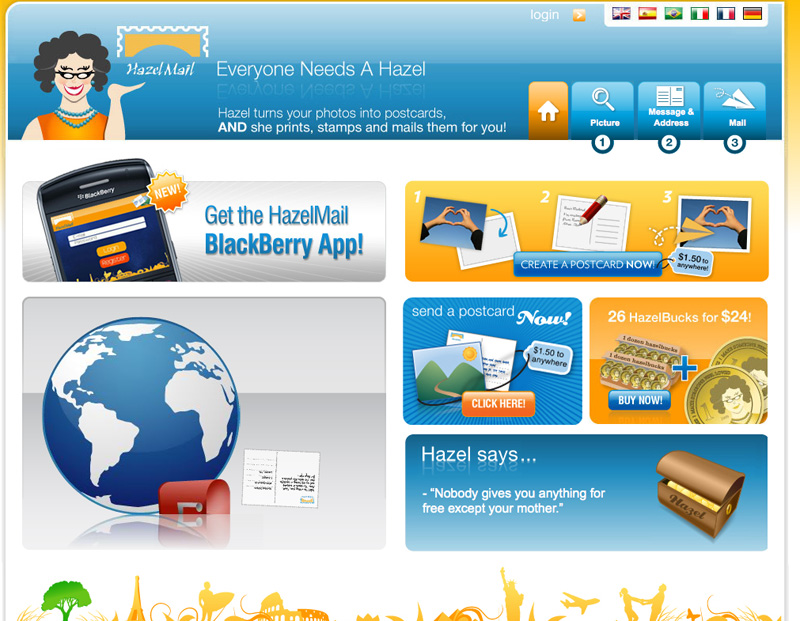
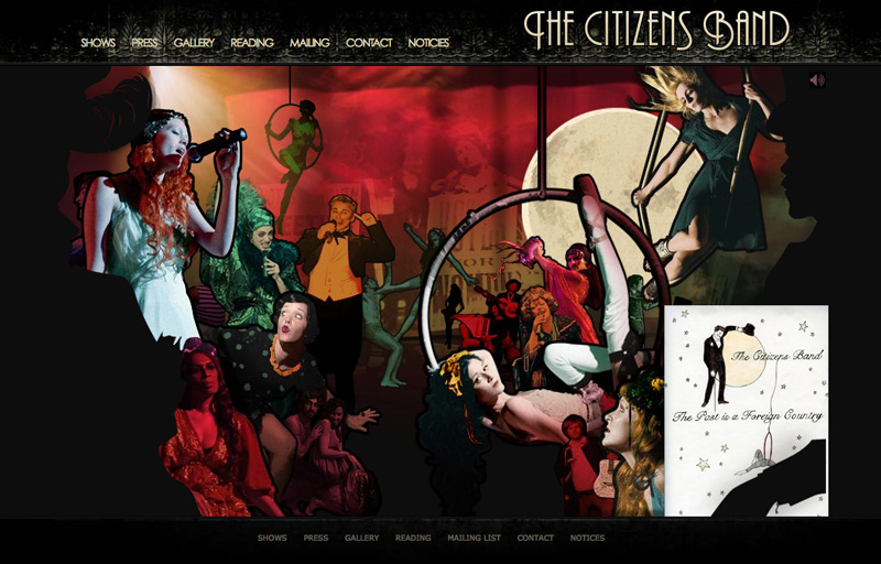
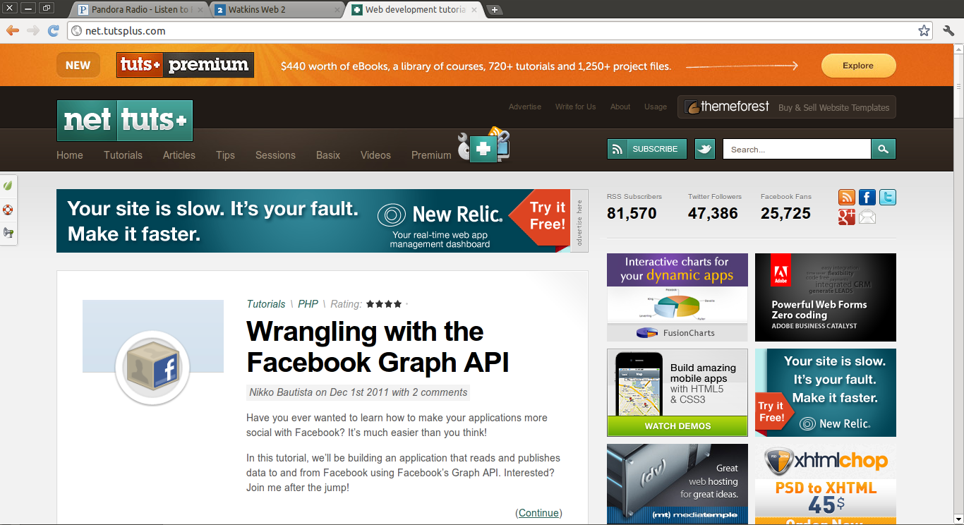
Great to see you all again last week, and also to see a few new faces. Like last semester’s website, this one will be used for announcements, tutorials, helpful links, show-and-tell screenshots, and exercises. Please feel free to post links, sites, artwork, etc. that you think others in the class can learn from.

You can download the syllabus here if you need a copy. And here, for reference, is the section on the two main projects:

Project 1: Personal Site

Create a website that presents you and your work to the public.

Do not use design elements or ideas from last semester’s work: you should take this project as an opportunity to write, research, and design a new (and more advanced) website, one with a more polished and cohesive visual design. You will be taking your site from concept to wireframe to Photoshop mockup to working code, so assemble your raw materials as early as possible.

Design thinking is encouraged: what visual or conceptual ideas can you incorporate to distinguish your site from others? Consider how your site’s dynamic elements can play against consistent elements to create interest without sacrificing usability. What roles can color, typography, imagery, and texture play that aren’t merely decorative? What structures (visual or otherwise) can you incorporate that relate to or highlight qualities in your art/design work?

Requirements

  • Your site must contain a gallery of art/design work, your contact information, and a short bio. Additional content might include an artist’s statement, a résumé, writing samples, a links/inspiration page, and/or a client list.
  • You are also free to incorporate dynamic embedding (Flickr photos, Twitter feed, etc) if that content makes sense as part of your concept and can be thoughtfully integrated.

Due Date: October 13, 2011

Project 2: Client Site

Create a multi-page website for an organization your participate in, work for, or know well.
The organization you chose could be a small company, non-profit, church, or club. While you must research your organization and use as much real content as possible, you are encouraged to bring your own sensibility and priorities to the project. To that end, the only mandatory visual design element is the organization’s current logo (if one exists). Your choice of organization must be approved by the instructor.

Once again, you will develop the site from concept to live code, evaluating your design decisions at every stage. What is the purpose of the organization, and how can the design of a website express and support it? What tone does it adopt in its print publications or advertisements, and to what extent should the website match that tone?

(This is “speculative” design, intended for your benefit — it is not recommended that you offer the real organization free work, especially without consultation and communication during the design process.)

Requirements

  • A minimum of five HTML pages
  • Recurring navigation controlled by PHP include(s)
  • A contact form that sends an email to an address
  • Events listing/calendar
  • Blog/News pages (both landing page and example of a single article page)

Due Date: December 8, 2011

Google reverse image search

Not sure if anyone has played around with it, but the google reverse image search is pretty cool. It's probably more helpful for design research, but there's one feature I'm really enjoying. The show visually similar images feature. You can just drag any photo from your computer or the internet and drop it on the Google Images search bar. It will pick images with a similar color palette and forms. Pretty cool!

google_image_search_1

google_image_search_2

Writing HTML with Textile

(To see the formatting syntax that created this post, view the Textpattern article that created it).

Textile is basically a shorthand for writing HTML with less code. It also does some automatic typographic conversion: straight ASCII quotation marks become “smart quotes,” double dashes become em dashes — like this — etc. There’s a more comprehensive list on the Threshold State site. Update there’s also a really great Textile Reference Manual on the same site.

This is strong text and this is emphasized text. All-caps strings of text longer than 3 letters — like NASCAR — get converted to <span class="caps">NASCAR</span>. This provides us with a global hook so that we can reduce their size and add letter-spacing, creating nice-looking small-caps with a single CSS rule.

This is is a top-level heading (an h1)

This is Subheading (an h2)

  • This is an unordered list
  • Another item
  • And another item
  1. This is an ordered list
  2. Another item
  3. And another item

This is an image:

This image is 800 px wide

And here’s a blockquote:

We hold these truths to be self-evident, that all men are created equal, that they are endowed by their Creator with certain unalienable Rights, that among these are Life, Liberty and the pursuit of Happiness. That to secure these rights, Governments are instituted among Men, deriving their just powers from the consent of the governed, — That whenever any Form of Government becomes destructive of these ends, it is the Right of the People to alter or to abolish it, and to institute new Government, laying its foundation on such principles and organizing its powers in such form, as to them shall seem most likely to effect their Safety and Happiness.

You can use the code tag for code samples: <div id="awesome">. And here’s a whole block of code:

p {
color:red;
}

Exercises 1-3: Selectors, Box Model Review

Download Exercises 1-3

8/24/11 Update: I’ve fixed my typos and added solutions to the zipped file. Please re-download if you’re collecting these files for reference.

Zeldman: The Web Comes of Age

Godfather of the web Jeffrey Zeldman gave the keynote in June at the Design It. Build It. Conference. It’s about an hour long and definitely worth a watch:

Jeffrey Zeldman – The Medium Comes of Age from Codeworks Ltd on Vimeo.

Exercises 4-6: Floats, Positioning, and Faux Columns

Download Exercises 4-6

Update: Solutions are now included in the .zip.

FTP

Here’s a quick overview of FTP. Dreamweaver has FTP built in:see the Files palette. For freestanding FTP clients on the Mac, I recommend Panic’s Transmit ($34). The best free option appears to be Cyberduck, though its interface is a little clunky.

In general with FTP you have to fill out a bunch of fields correctly to connect to the server successfully. Almost all are case-sensitive, and it’s common to just make everything lower case for simplicity.

Lets review the settings assuming your name is Joe Schmoe:

Name: My Watkins web space
This is just a nickname for your own reference. Be descriptive.

Protocol: FTP
Stands for File Transfer Protocol. The most common alternative is sFTP: it’s much more secure and you should use it when you can. But our provider (Dreamhost) uses FTP.

Server: ftp.watkinswebdev.com

Username: wat_jschmoe

Password: [you got this in class]

Port: 21
Rule of thumb: FTP requires Port 21. sFTP requires Port 22. For what it’s worth, all internet traffic is sent through a port: the world wide web itself usually uses Port 80. See the Wikipedia article on port numbers for more.

Remote Path: watkinswebdev.com/jschmoe
This simply tells the FTP client to jump directly to a particular sub-folder on your server as soon as it connects (so as to save you clicking). On watkinswebdev.com we need to jump two levels down until we get to the folder that contains your “root” folder. If you sign up for hosting yourself, you might well need to use a Remote Path that looks like jschmoe/web/public/. The point is that the particular folder structure on the server usually looks a little different from the web URL structure. But once you figure out what the “root” folder is, it makes sense: Putting a file called page.html in watkinswebdev.com/jschmoe means it will be available at http://www.watkinswebdev.com/jschmoe/page.html.

Update: for your reference, here’s about what your FTP settings should look like you’re using Cyberduck:

FTP Settings

Quiz: Markup, Selectors, Layout

Part 1: Markup

  1. Circle the markup that would definitely throw a validation error (i.e. you know it’s wrong without needing to see the context in which it appears):
    1. <a id="home link" href="home.html">Home</a>
    2. <li class="item" id="item">A gallon of milk</li>
    3. <h1><strong>My Page<h1></strong>
    4. <img src="photo.jpg" />
    5. <a class="outbound-link news" href="http://nyt.com">New York Times</a>
    6. <h2>Welcome to this <span>Site</span></h2>

Part 2: Selectors

Suppose the following markup appears on a page:

<body>

<div id="wrap">

<h1>My awesome page</h1>

<ul id="nav">
<li><a href="index.html">Home</a></li>
<li><a href="work.html">Work</a></li>
<li><a href="about.html">About</a></li>
</ul>

	<div id="main">
	<p>My name is Joe. I love design.</p>
	<p>When not working for the <span class="caps">CIA</span>, 
		I do <a href="work.html">design work</a>.</p>
	</div> <!-- /main -->

	<div id="sidebar">
		<h2>Useful Links</h2>
		<ul>
		<li><a href="http://joeschmoe.com">Joe Schmoe</a></li>
		<li><a href="http://pentagram.com">Pentagram</a></li>
		<li class="edu"><a href="http://watkins.edu">Watkins</a></li>
		</ul>
	</div> <!-- /sidebar -->

</div> <!-- /wrap -->

</body>
  1. Circle the CSS selector(s) that would successfully target the hyperlinks inside the navigation list and no other links on the page.
    1. ul a
    2. #nav li a
    3. ul li a
    4. ul#nav a
  2. What CSS rule(s) would successfully render “CIA” in small caps?
    1. span#caps {letter-spacing:1px; font:.9em;}
    2. span.caps {letter-spacing:1px; text-size:.9em;}
    3. #caps {letter-spacing:1px; size:.9em;}
    4. .caps {letter-spacing:1px; font-size:90%;}
  3. Circle the CSS declaration(s) that would successfully add top and right margins of 10px each to the targeted element.
    1. margin:0 10px;
    2. margin:10px 10px 0 0;
    3. margin-top:10px; margin-right:10px;
    4. margin:10px 0;
  4. Circle the CSS rule(s) that would successfully add a gray background to the unordered list in the sidebar and inset the text from its edges (so that you can see gray all around the text).
    1. #sidebar ul {background-color:gray; padding:10px;}
    2. ul#sidebar {background-color:gray; padding:10px;}
    3. #sidebar h2 ul {background-color:gray; padding:10px;}
    4. ul #sidebar {background-color:gray; margin:10px;}

Part 3: Layout

Let’s say we want to make main a 400px-wide column on the left and a 300px-wide sidebar to its right, with everything sitting on a gray background.

  1. Circle the CSS rule(s) that would successfully put the “Useful Links” all on a single row, next to each other.
    1. #sidebar ul {list-style:none; float:left;}
      #sidebar li {float:left;}
    2. ul#sidebar ul {list-style:none;}
      ul#sidebar li {display:inline;}
    3. ul .sidebar {list-style:none; float:left;}
      ul .sidebar li {float:left;}
    4. .sidebar {list-style:none;}
      ul li.sidebar {display:inline;}
  2. Circle the rules that — working together — would achieve this layout using the “Opposing Floats” technique.
    1. #wrap {width:700px; background-color:gray;}
    2. div#wrap {width:700px; float:left; background-color:gray;}
    3. div .wrap {width:400px; background-color:gray;}
    4. #main {width:400px; float:left;}
    5. .main {width:400px; float:right;}
    6. #sidebar {width:300px; float:right;}
    7. .sidebar div {width:300px; float:right;}

Demo: htaccess, server paths, relative vs. absolute

Please download the files to your desktop.

Update: Here are some more resources on using .htaccess to reconfigure server behavior:

Exercise 7: Aligning Type to a Baseline Grid

Download Exercise 7

Further Reading

Review: Classes, IDs, Selectors

For your reference I’m reposting this guide from the Web 1 blog:

Classes vs. IDs

Classes and IDs should first be understood as attributes that you add to HTML entities – they just happen to be particularly useful as targets of CSS selectors. So you might change <p>Some content</p> to <p id="footer">Some content</p> so that you can style it a particular way.

The point of IDs is that they are unique identifiers for a particular HTML entity. Therefore, they only be used once on a page. If you want to create a set of things to be styled the same way, use a class: you could have <p class="infobox">Welcome to my site</p> near the top of the page and then <p class="infobox">Check out my other website...</p> further down the page.

CSS Selectors

Pay careful attention to the use of spaces: they indicate a descendent selector. p#special refers to the HTML element <p id="special">, but p #special (with a space after the p) refers to “anything with an id of special inside a paragraph.” For example, the span inside <p>Some content <span id="special">some nested content<span></p>

This table summarizes the most common ways to style elements using IDs, classes, and descendent selectors:

What we want to style HTML CSS Rule
All paragraphs <p>Sample</p> p {color:red;}
All paragraphs with a class of special <p class="special">Sample</p> p.special {color:red;}
The (only) paragraph with an id of first <p id="first">Sample</p> p#first {color:red;}
Anything with a class of warning <p class="warning">Sample</p>, but also <ul class="warning">, <div class="warning">, etc., if they exist. .warning {color:red;}
Paragraphs nested inside the maincontent div <div id="maincontent"><p>Sample</p></div> div#maincontent p {color:red;}
List items nested inside unordered lists that have a class of ingredients <ul class="ingredients"><li>Sample</li></ul> ul.ingredients li {color:red;}

Exercise 8: Modular Grids with CSS

Download Exercise 8

The grid in this exercise was adapted from the 960 grid system. When you get a chance, you should take a look and download the template files from there, too. Of course you may well prefer to construct your own grid for your project.

Here’s a brief description of the concept going on here: Very often we want to crate a grid-based design, where the content is structured with a system of columns and subdivisions. Each div (or list, or paragraph) will be a certain number of grid “modules” wide. So instead of specifying the pixel width we want for every element using IDs and CSS, we define a system of width classes (.w1, .w2, .w3 ….) that match our module widths. Then we apply them to each HTML element we want to control. We also define two float classes (.left and .right) and use these in conjunction with the width to control the layout. A two-column div that needs to be floated right would then just get the two corresponding classes: <div class="w2 right">bla bla</div>. A 1-column div that needs to be floated left would look like this: <div class="w1 left">Bla bla</div>.

In general we don’t want to go too crazy with this system and apply width classes to every single element. But it’s definitely useful for the primary containers on a page.

Update: Solutions are now included with the files.

Katelyn Joughin

Here are my websites from my show and tell.

I liked this website Stephen Hamilton because of the way the portfolio was presented. I think it was very interesting and the huge photos were a plus!

I thought this was a great interactive website Timberland Boot Company although, it had some major glitches. For example the mouse would disappear under certain images. It would be cool for a game interface, like moving around on a map, but for this reason it seemed like it didn’t belong

I liked this website Matt Salik, because of the way the portfolio was presented. I think it was very interesting and the huge photos were a plus!

I thought that the website Utah Travel was great state website. It captured my eye and made me want to visit Utah. It was very user friendly with nice clean graphics.

Exercise 9: Navigation Bars

Download Exercise 9

Update (Dec 1, 2011): The solution is now included in the files.

Further Reading

Exercise 10: jQuery

Download Exercise 10

The instructions are in the HTML file. This is mostly a tinker-and-see-what-happens exercise, so there is no separate solutions file.

Further Reading

Atrian's Show and Tell

I enjoyed the following two websites for their innovative design styles.


DontClick.It


Don’t Click It used an innovative navigation style that utilized a hovering based selection over clicking. It was interesting how it managed to allow the user to maneuver with hovering while still making sure the the user wanted to go to the next page.


dontclick.it opening page

dontclick.it main page

Saab Saibu Tour

The Saab Saibu Tour was a flash site the used an interesting interactive commercial design that allowed the user to tour a car commercial while remaining somewhat in control.


Saab opening page


The slideshow of Saab cars over time was particularly interesting.


Saab image slideshow

jquery

Here is a JQuery How To site with some basic JQuery stuff on it. Like commenting out a line.

Think Tank is this Saturday

You should all consider attending Think Tank Nashville, the one-day conference this Saturday. There’s a great line-up of speakers, including Raphael Grignani from Method.

It’s September 17 at Rocketown and costs $50 for student AIGA members.

Bostonglobe.com

Boston Globe redesign

Remember responsive design from last semester — the combination of percentage-based layout, scalable images, and media queries that lets pages adapt fluidly to the browser/device width?

Yesterday a new Boston Globe website was launched “for all devices”. I think it’s probably the largest responsive website designed to date. It was created primarily by design studio Upstatement and the developer shop Filament Group, with help from Ethan Marcotte, the designer/developer largely responsible for the term and many of the ideas behind “responsive web design.”

Check out the blog posts from Upstatement, Filament Group, and Ethan Marcotte.

Kasteelbier - Kelsey's Show & Tell

I thought this brewery's website would be interesting to share. It surprised me how much a company like this would put so much effort into such an interactive website.

intro

door

kitchen

The Document Object Model

Whenever you hear about the “Document Object Model” (or “DOM”), it’s usually in the context of Javascript. But it actually applies to CSS, too, when you have to decide what kind of a selector to use. The diagram below shows how you might draw the structural relationship of a simple page, and therefore what relationship the individual elements have to each other.

Example web page

Document Object Model diagram 1

Page translated into a “tree and node” diagram

Document Object Model diagram 2

CSS selectors

This should help clarify some of the selector syntax we have been working with, and the situations that each is useful for:

/* Set every paragraph in Georgia */ 
p {font-family:georgia, serif;}
/* Create small-caps for every span that has a class of caps */ 
span.caps {font-size:.9em; letter-spacing:1px;}
/* Turn span text green, but only if the span is 
a descendent of emphasized text (here this rule will be applied 
to the second span only) */
em span {color:green;}
/* Italicize paragraphs that are the first child 
of the #main div (here this rule will be applied 
to the first paragraph only) */
#main p:first-child {font-style:italic;}
/* Put spans in bold, but only if they are 
children of paragraphs (here this will be applied 
to the first span but not the second) */
p > span {font-weight:bold;}

Further Reading

Lindsey's Show-n-Tell-n-Click

Hello Giggles

giggle

A Monet Exhibition Site

monet

Clearing floats: the Advanced Version

Most medium-complex sites involve floating elements to put them side-by-side. Often we want elements that follow floated elements not to be affected by them. Here are the top three ways to deal with clearing floats.

Using a dedicated .clear class

HTML

<p class="clear">Some text that follows some floats elements</p>

CSS

.clear {
	clear:both;
	}

Using a dedicated .clearfix class to make a container “self-clearing”

HTML

<ul id="gallery" class="clearfix">
<li><a href="#"><img src="image.jpg" alt="Image" /></a></li>
</ul>

CSS

#gallery li {
	float:left;
	}
.clearfix:after {
	content: ".";
	display: block;
	height: 0;
	clear: both;
	visibility: hidden;
	}

For those scoring at home, the idea is to use the :after pseudo-class to insert the period character (.), set it to display:block, clear any floats, and then hide that extra character. Clever.

Exercise 11: Translating PSDs to Markup + CSS

Download Exercise 11

Tonight the primary goal will be to translate the PSD pages into valid and semantic HTML: don’t even worry about the CSS yet. That said, you’re welcome to create IDs and classes in the HTML (e.g. <div id="maincontent">) that you’re pretty sure you will need when you get to the CSS.

Please do not try to implement a module system for this exercise: just use semantic class and ID names and attach them to your <div>s, <span>s, <p>s, <h1> - <h6>s, <ul>s, etc.

Update: A solution with both HTML and CSS is now included with the files.

Exercise 12: Conditional Comments and Basic HTML5

Download Exercise 12

Your task is edit html5.css so that html5.html and xhtml.html look exactly the same in the browser: to do so you’ll have to change the selectors in html5.css to correctly target the newer HTML5 tags being used in html5.html.

Aaron's Cool Story

Design Fighter

This is a site a friend of mine made a couple years back for his senior portfolio show. It is bases on arcade style fighting games. Unfortunately the site was only up for a while, but I have a copy on a disc.

Chiptune.com

This is another site style after a retro interface. In this case it’s about 8-bit music. Unfortunately too much creative styling can make a site hard to navigate.

http://www.chiptune.com/

this might be elementary... but i had to share

CSS Cheat Sheet

Scrolling and Typography

2011 Beercamp

The pages move towards you when scrolled

Buero-Buero

The images move in 4 directions when scrolled

NetMagazine

This falls under user choice, list or grid format

Mr Doob

Flash Experiments

Lost World's Fairs

Typography set with CSS

Exercise 13: HTML5 Video

Download Exercise 13

Important: Serving video on a live web server

If posting to a server, your videos probably will not play unless you add this to your .htaccess file:

AddType video/ogg .ogv
AddType video/mp4 .mp4
AddType video/webm .webm

Further Reading

Codecs

  • Handbrake, Mac software useful for encoding video as h.264 .MP4s.
  • Firefogg, an awesome Firefox extension that will convert your video to the ogv format.

Furthermore

Exercise 14: Responsive Design

Download Exercise 14

Update: a solution is now included with the files.

Open page outline.txt, index.html, and style.css and examine the code to see how the basic structure is set up. As you review the CSS file, note the three canonical features of a “responsive design”:

  1. The main container (#container) is only restricted by a max-width property, meaning it can contract to a smaller width when the browser window gets skinnier than 1200px.
  2. Images on the page do not have width and height attributes. Instead, CSS is used (max-width:100%) to allow them to scale down with their container. Using max-width instead of width ensures that the images will never be scaled up and get pixellated.
  3. Finally there are two media queries set up to detect when the browser becomes “medium-wide” (600 – 999px) and “wide” (1000px – 1200px). These contain distinct rules that supplement or override the primary rules above them in the stylesheet.

Your task is to find all the instances of PERCENT and choose replace them with actual percentage values that will make the page lay out differently for medium and wide screens. The medium layout should use two columns, while the wide column should use three.

Further Reading

  • Responsive Web Design, Ethan Marcotte’s article that kicked the movement off.
  • Responsive Web Design, Ethan Marcotte’s book. $9 for the ebook.
  • Media Queri.es, a website showcasing sites built with responsive designs.
  • Mobile First, Luke Wroblewski’s manifesto that we should build our sites to work well on mobile platforms first, then progressively enhance them to work on desktop browsers.

Oat, the design company of Island Creek Oyster Bar

A clean, flash free site

Island Creek Oyster Bar

another clean, no flash site

A great site with no flash.

The Frist Center For The Visual Arts

The Frist site is clean and responsive. Easy to navigate.

Clean, responsive design

Responsive Media

Here are two resources I’ve found useful in making responsive designs recently

  • Flexslider is a jQuery plugin that turns an unordered list of images into a “carousel” or simple cross-fading slideshow. It’s very similar to the Cycle plugin, except that it manages responsive images much better: just leave the height and width attributes off your <img /> tags, set them to max-width:100% in your CSS, and they’ll work as they should.
  • Elastic Videos shows you how to embed Youtube videos so that they, too, can resize with the browser.

Jill's show and tell

My favorite of the sites that I brought for show and tell is the site that helps you select a name for your child, create a custom logo and then sell you a bunch of stuff with that logo on it. The site is What a Lovely Name. My next site was more difficult to navigate. It was a portfolio site for photographer Marcin Kaniewski. I liked the ability to change the back ground color to black, white or gray. I liked portions of the last two sites that I showed. On the site for Lisa Bun, I like the way the links at the bottom looked and behaved. 
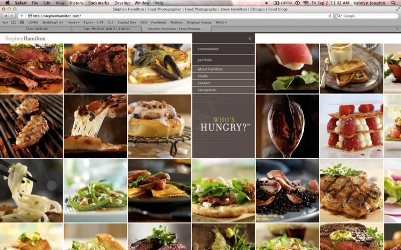
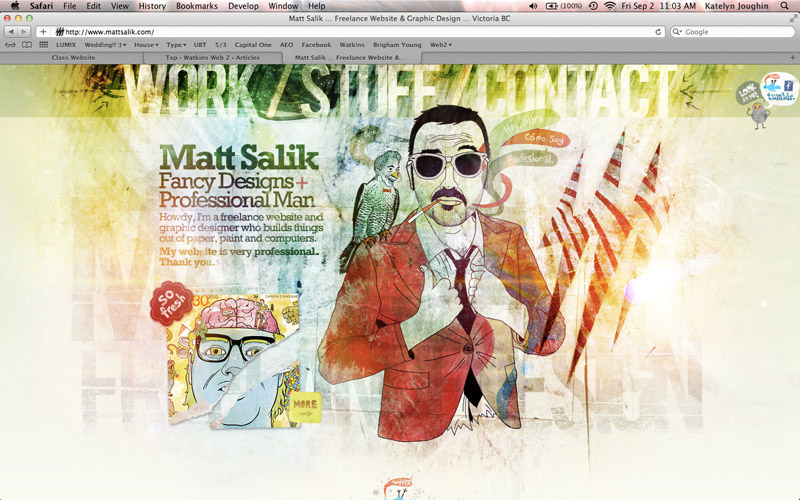
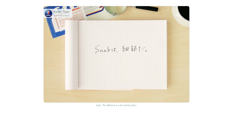
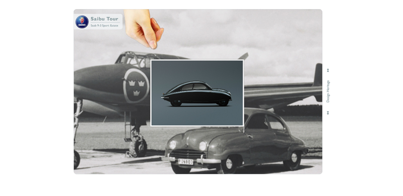
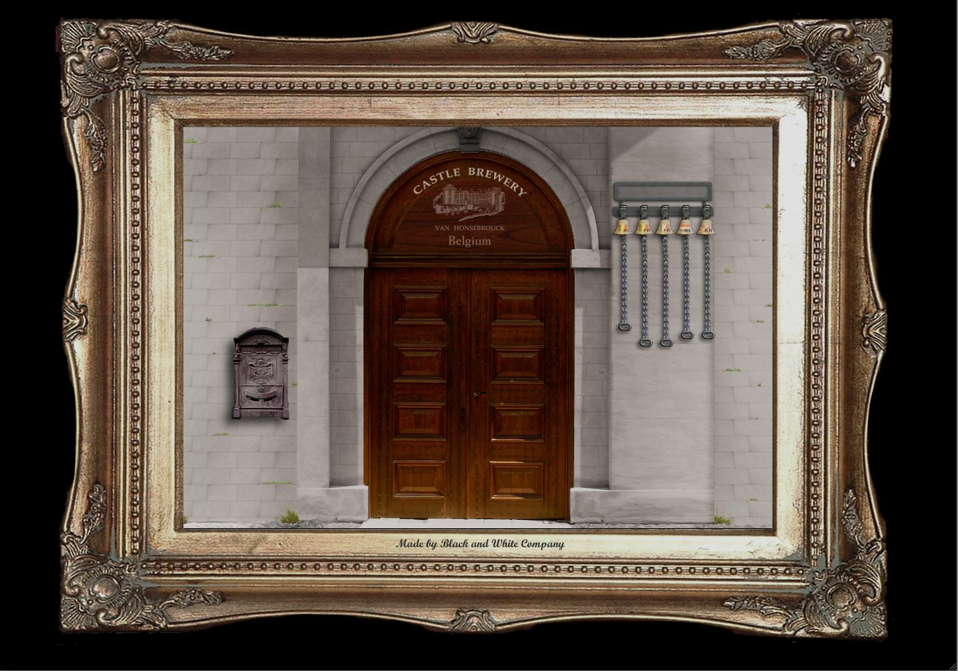
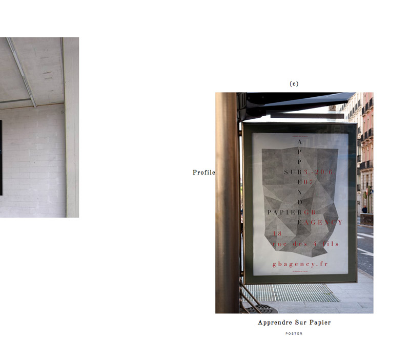
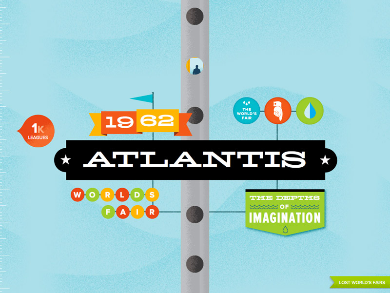
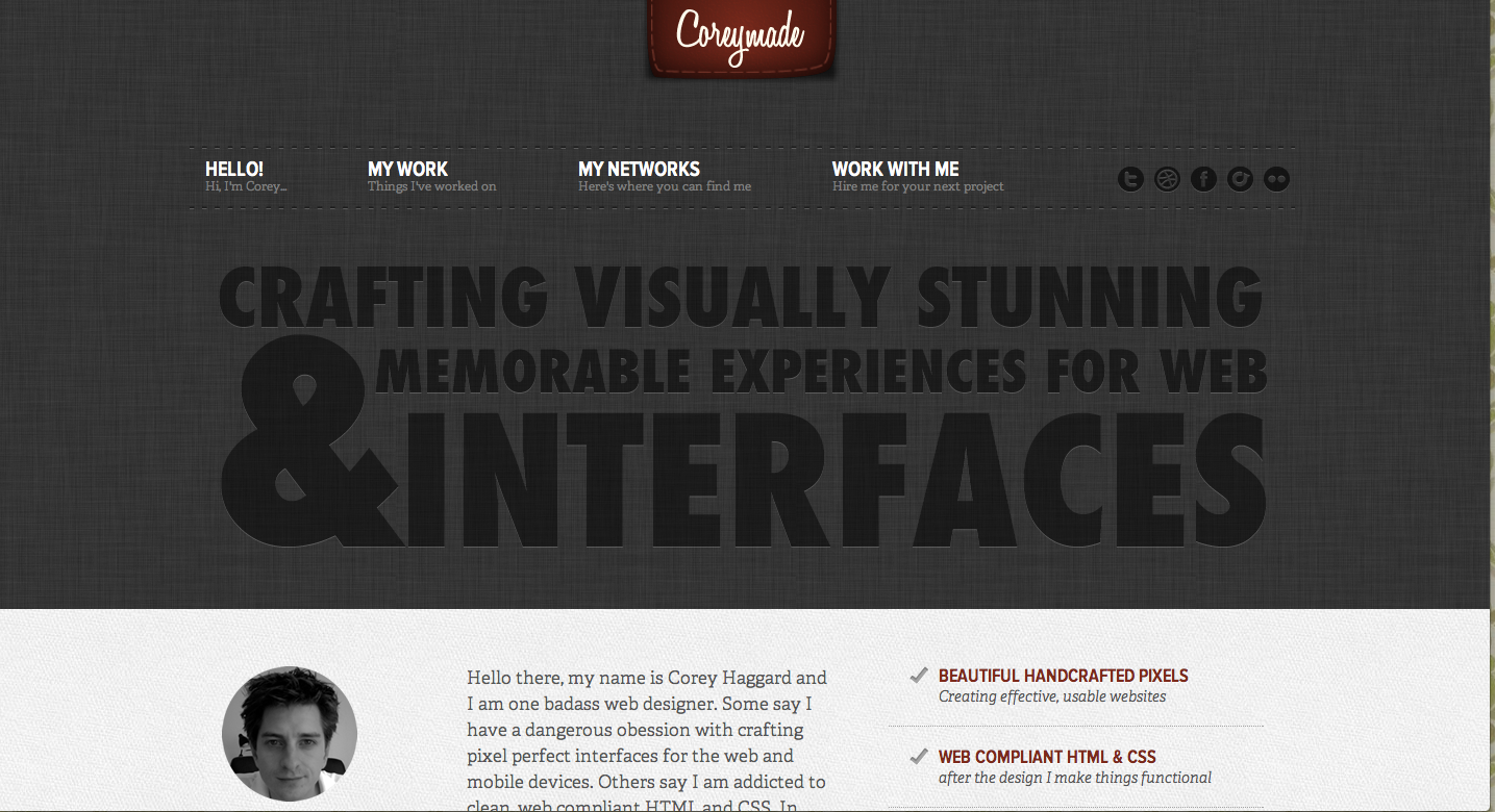
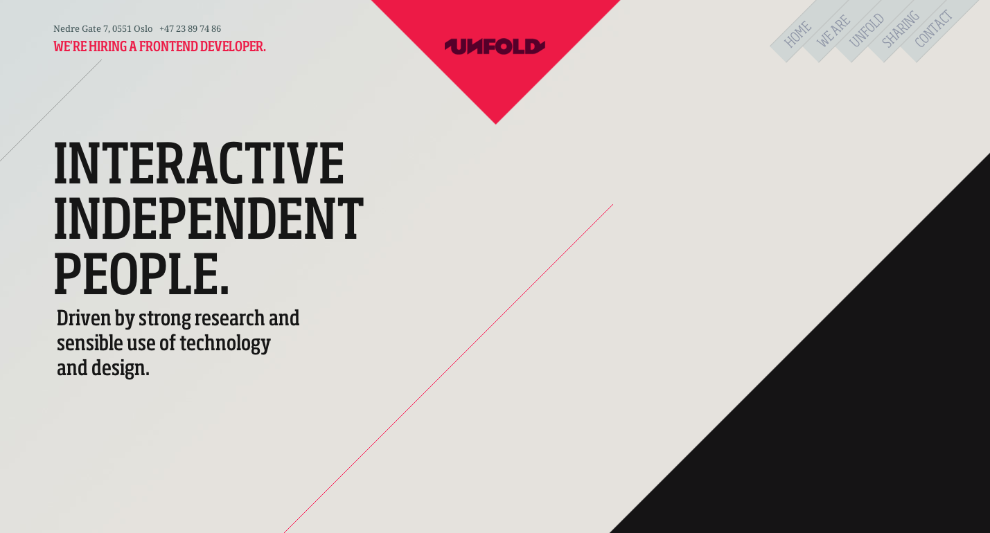
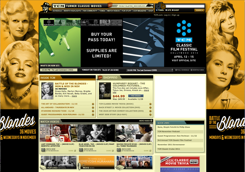
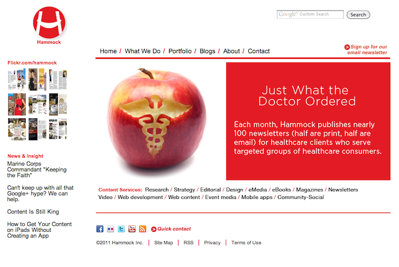
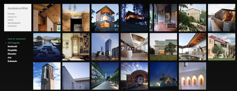
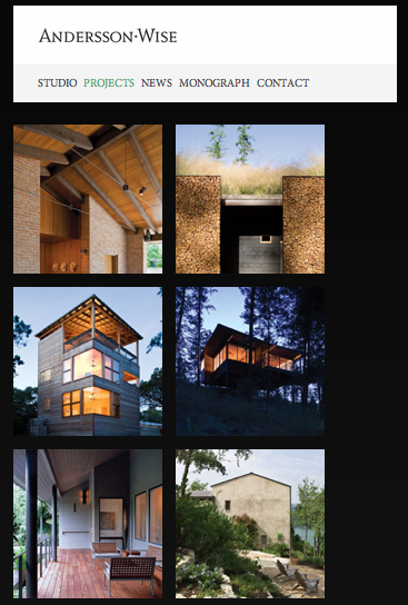
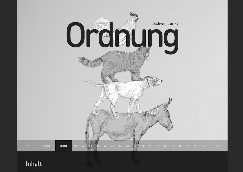
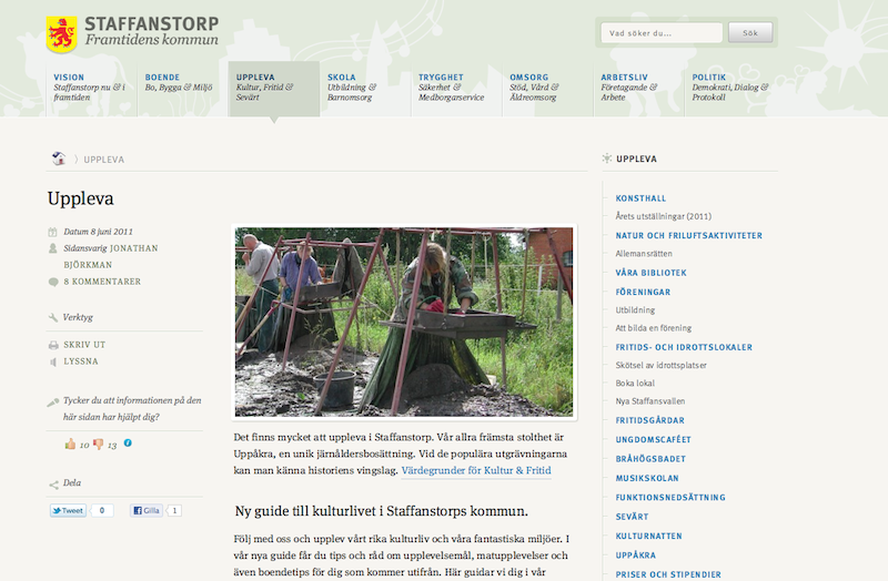
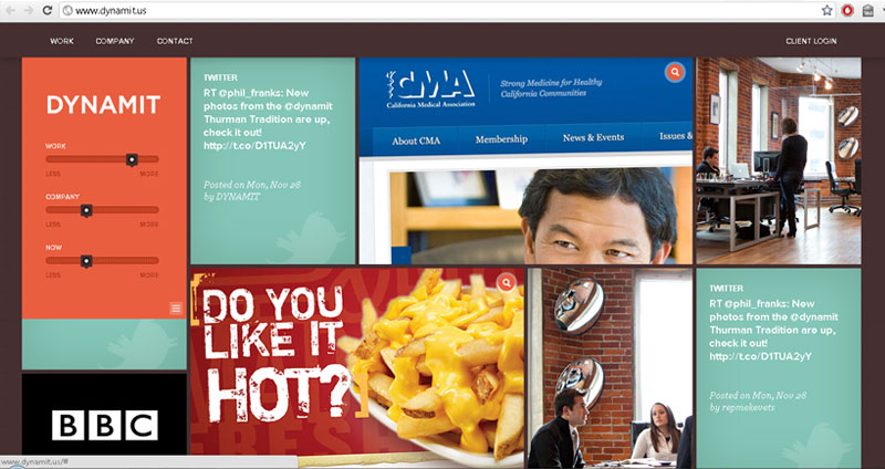
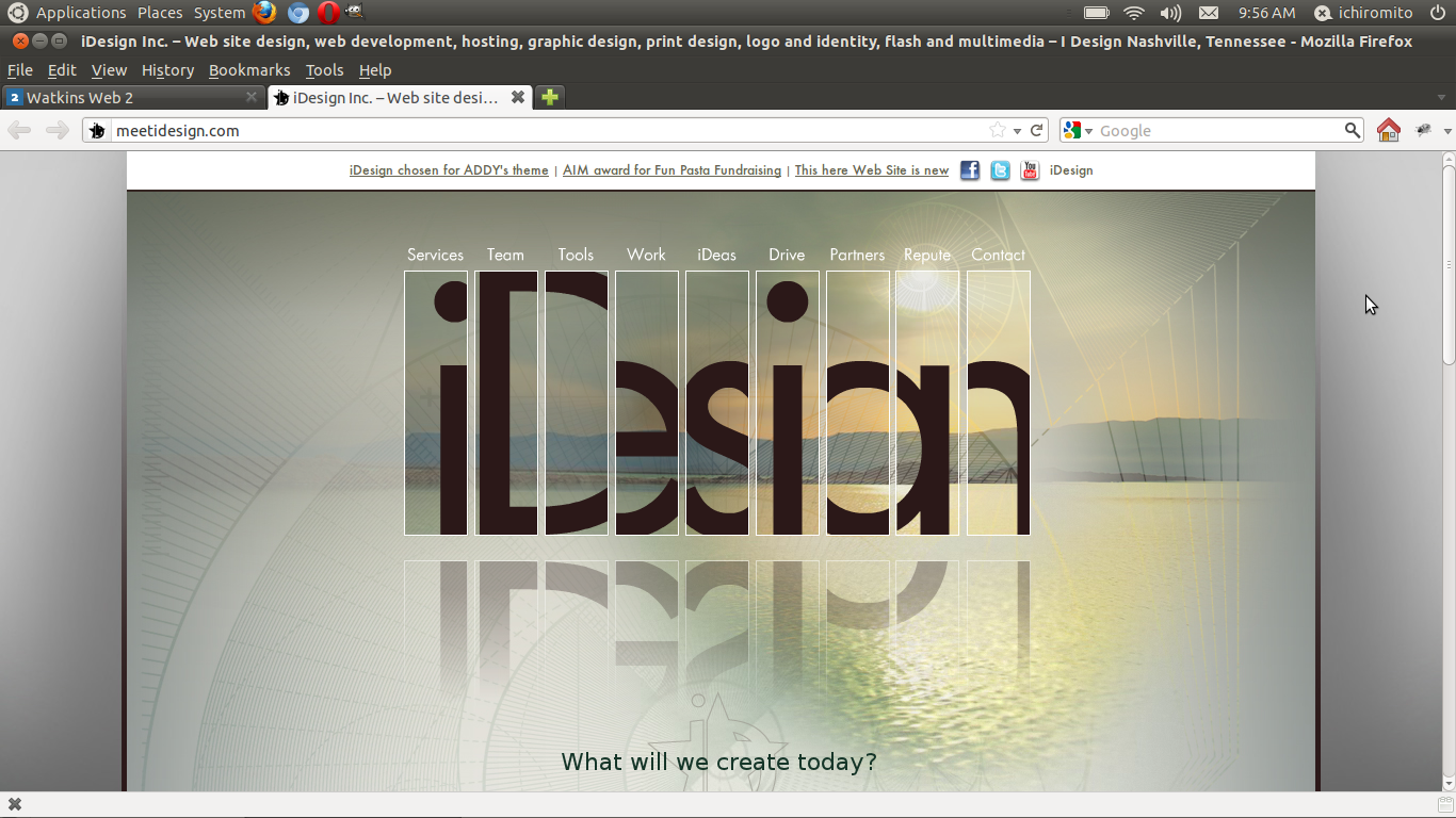
On the site for the firm called
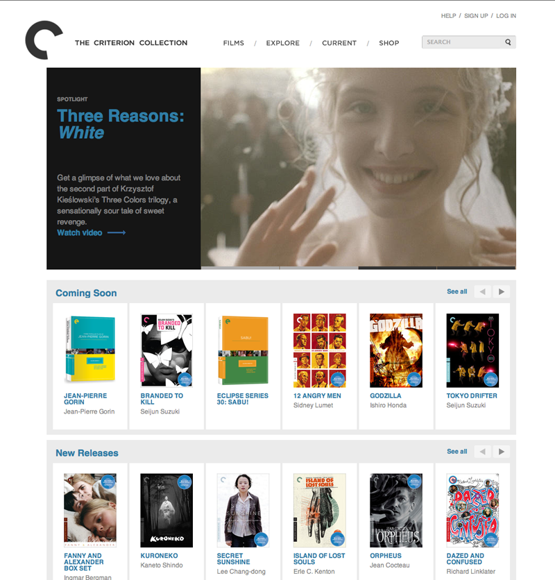
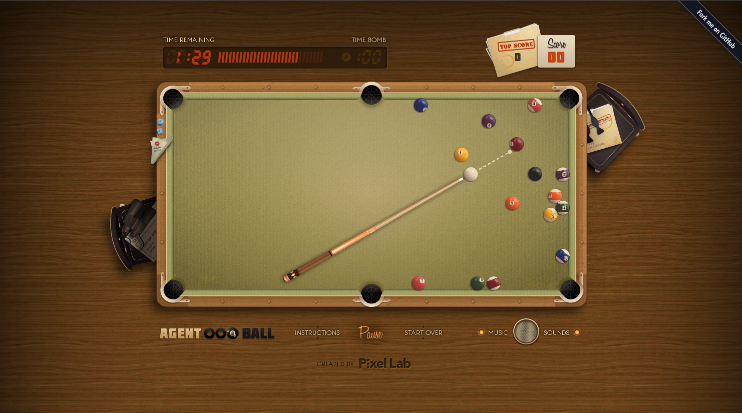
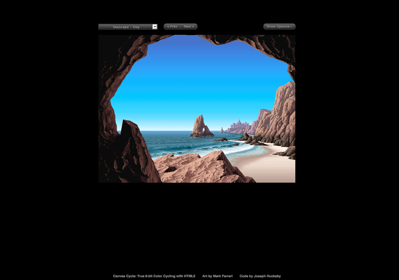
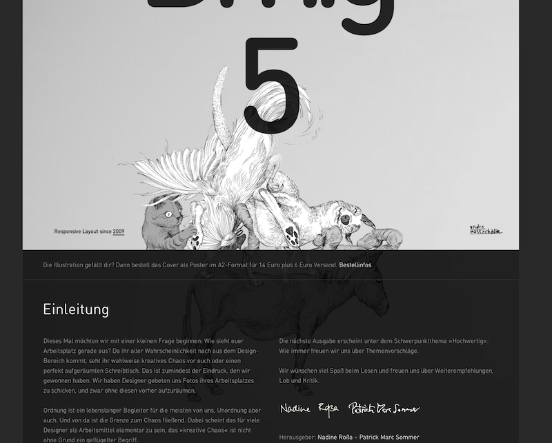
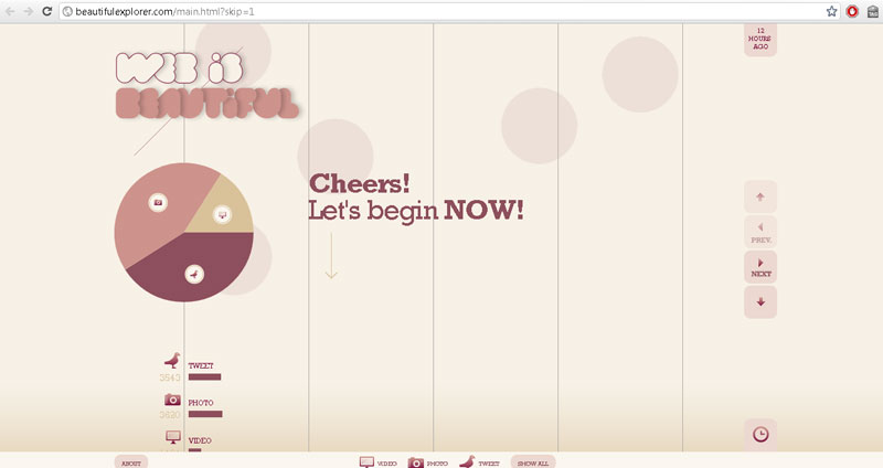
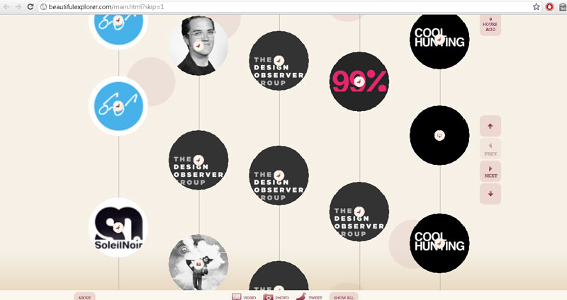
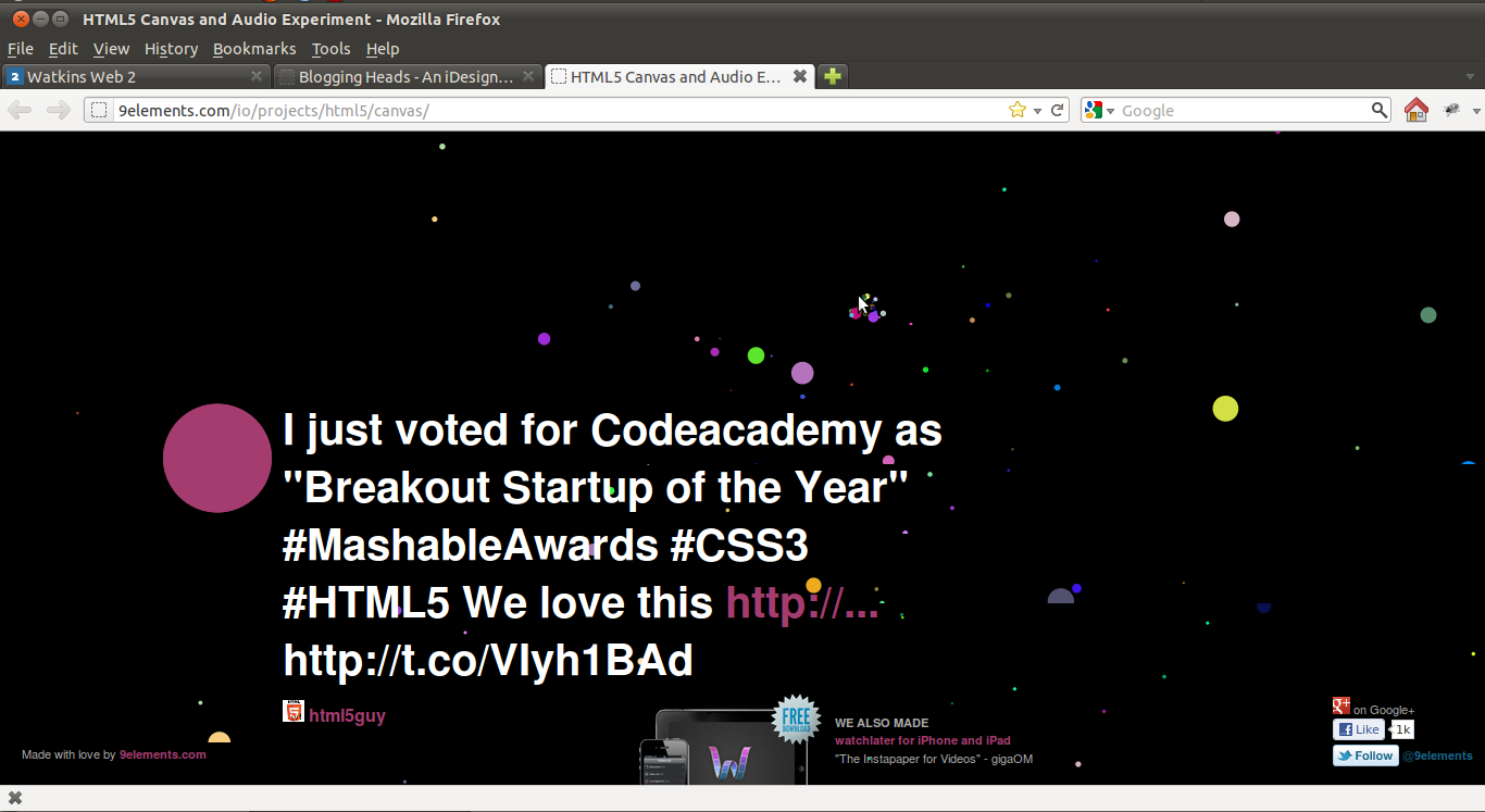
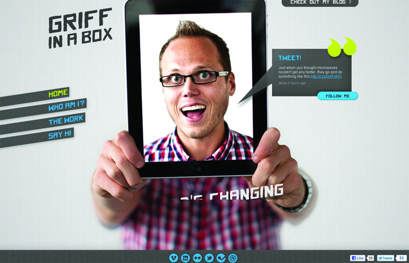
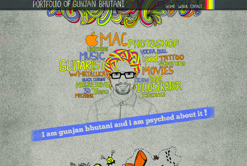
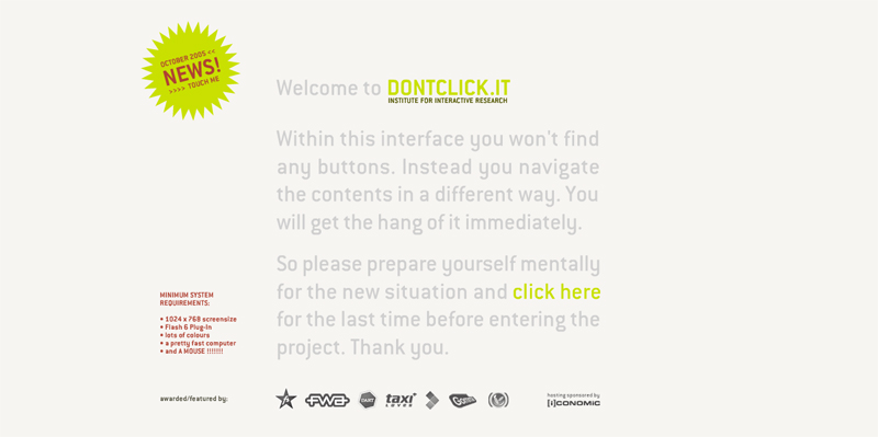
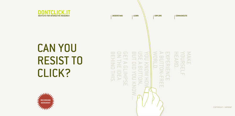
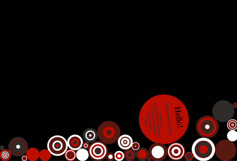
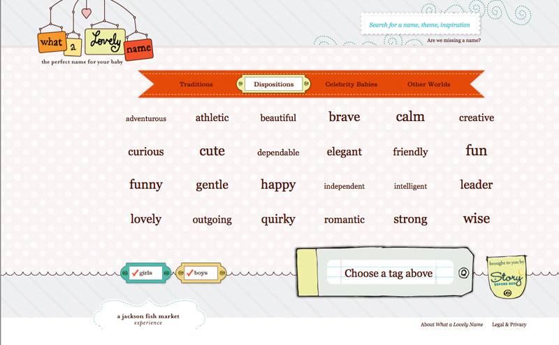
 Circus, I liked the font combinations that they used.

Xavier's Show and Tell

I know I'm really late but here is my show and tell.
First is The site fir Interview Magazine. I really liked the little touch of having the "hanging tab" as you scroll down.
Visit Site

Second is AgencyNet.com, a really cool Flash site for a creative company.

Project 1 Details

I hope you all are doing well with Project 1. To summarize, Project 1 is due at the beginning of class on Thursday, October 13. Please be ready to copy your files to the Flash drive that I will pass around.

Here’s a quick housekeeping checklist (these are required):

  • All your files must be in a single folder (named lastname-project1) which contains only the files necessary for your site. No old drafts, no PSDs, no PDFs: just .html, .css, and .js files plus your images. You’re free to organize these into folders however you like; just make sure your href and src attributes are written as relative paths to their corresponding page (e.g. <img src="images/poster1.jpg" />).
  • All your filenames must be all lowercase
  • Your home page file must be named index.html
  • Your pages must be primarily driven by a single stylesheet (the acceptable exception would be extra lightbox or slideshow stylesheets that work in addition to yours)  
  • Images must be properly optimized. Rectangular images that don’t need transparency should be saved as JPGs with a quality setting of 70-80. Images that require transparency should be saved as PNG-24. 

And here are the content requirements from the syllabus:

  • Your site must contain a gallery of art/design work, your contact information, and a short bio. Additional content might include an artist’s statement, a résumé, writing samples, a links/inspiration page, and/or a client list.
  • You are also free to incorporate dynamic embedding (Flickr photos, Twitter feed, etc) if that content makes sense as part of your concept and can be thoughtfully integrated.

Design Considerations

Typography

Make sure to give your project a typographic audit: first and foremost, proofread your text. Then take a look at the finer points: do your quotation marks on block quotes hang in the margin? Do drop-caps line up with their baseline, and have small caps been used if appropriate? Have you used the correct HTML entities for quotation marks, dashes, ellipses, etc.? Remember you can speed up this process by running your text through Textile.

Grid System

Most of you are using a grid system to organize your content into a system of columns that have a mathematical relationships. Try checking your grid alignments by taking a screenshot of your web page and then bringing it into your Photoshop mockup.

Code Considerations

Validation

Please validate your HTML and CSS. You need not use perfectly valid code (especially if employing CSS3 properties or pulling in external content), but none of your errors should come from unclosed tags, missing alt attributes, or CSS syntax errors.

Markup

Strive to use semantic — not presentational — markup. This fundamentally means using the right HTML tag for the content you are marking up. Your primary “vocabulary” for your text content includes h1-hn headings, paragraphs, lists, and blockquotes. For example, navigation links are traditionally marked up as an unordered list (<a>s nested in <li>s nested in a <ul>). If using HTML5, you’ll want to wrap this list in a <nav> tag as well.

In addition, although the browser can’t understand them, you should be preferring semantic class and ID names, too: main, intro, caption, gallery, subnav all describe what the content is, not how it will look when the stylesheet is applied. If your pages are filled with names like bluebox, largetext, or indented, you should go back and reconsider them.

Smart CSS

This project is an opportunity to practice using efficient CSS. Make use of the descendent selector (ul#nav a) rather than putting a class or ID on every element. Apply classes and IDs to your primary content containers so that you can target the contents of each one selectively. Remember that you can apply the same set of rules to multiple elements using a comma (#main ul, #sidebar ul). Take a look at the Document Object Model the Review of Classes, IDs, and Selectors posts as reference.

“Bulletproofing” Your Site

We’ve talked about the principals of “progressive enhancement,” “graceful degradation,” and the philosophy of developing “mobile first”. These are largely interrelated ideas: our stylesheets and javascripts should always be written in ways that anticipate non-ideal conditions: small screens, slow connections, old browsers, or lack of Javascript support. Here are some good habits to help make this happen:

  • If possible, don’t specify heights on the primary containers in your pages (usually divs): it’s better to let the content itself expand the box — that way you can add more content later without updating the stylesheet, or even recycle the same div and ID on subsequent pages that contain different amounts of content. Use padding on the content to create space inside the container, and margins on the individual elements to create space between them.
  • Stress-test your pages by resizing the text up and down a few times. (Make sure to check View > Zoom Text Only) in your browser. If the layout breaks, you may be able to improve the page by specifying fewer widths and heights on your containers.
  • When styling links as buttons, use padding in combination with display:block; so that your clickable area include the entire button, not just the link text.
  • When floating elements, you almost always need to specify widths. If the floats are interfering with the content that follows them in the markup, use the clearfix trick on the container of the floats.

Good luck!

Intro to The Shell

The Mac’s Terminal.app program lets you control the system with text commands, sort of like DOS before Windows arrived. Technically you’re using this interface to interact with Mac OS X’s Unix underpinnings, bypassing the graphical user interface entirely. (Unix is an open-source operating system that dates back to the 1970s: many present-day operating systems are built on top of it, including Mac OS X and  the various kinds of Linux, some of which run on personal computers and others of which run on web servers). Apache is a web hosting program that runs on Linux. Windows is not Unix.

Terminal’s text-only environment is variously called “the terminal,” “the command line,” “the shell,” and bash (short for “Bourne-again shell” — don’t ask). In general, you can use the shell to run scary system-level scripts, monitor system processes, log into other computers or remote web servers, etc. Serious nerds even edit text files with shell programs like Vim, Vi, or Emacs.

The first thing you’ll notice about the shell is its limitations: you have to use the arrow keys to move around, you can’t select text and delete it, you can only clear a line you’re writing with [ctrl] c, etc. Try exploring with the commands below.

Important Commands

Command Description
pwd Path of working directory
Outputs the current folder you’re in
ls List files
Shows all files and folders in the current working directory
clear Clear
Clears the screen
cd foldername Change directory
Moves you into a different directory. Use cd.. to go up a level. You must “escape” spaces with a forward slash: cd My\ Folder. Note that you can drag a file or folder from the Finder right into Terminal and it will insert the corresponding file path instantly.
cp filename.txt filename2.txt Copy
Copy a file — you must provide both the original and new file names, separated by a space.
mv filename.txt path/to/folder/ Move
Move a file — you must provide the file name and a destination directory, separated by a space.
mkdir foldername Make directory
Creates a new folder
curl http://website.com Client for URLs
Scoops the HTML source of a webpage and outputs it
banner word Banner Text
Outputs ridiculous sideways ascii art of word
[ctrl] c Cancel
Clears the line that you’re writing
Up arrow
Shows previous commands. Keep hitting ↑ to go further back in your history and ↓ to go forward.

Further Reading

Katelyn Pennington

Here are my websites from my show and tell.

I liked this website Pandr because the colors were great! I liked the way the top of the page stayed the same but featured different items. I also liked the clean and simple style.

I really liked the way Corey Made used all one page with his links that navigated down the page instead of to many different html pages. I really like the presentation of his work.

Unfold was the most unique website I have ever seen. I thought the layout was so interesting. I feel that some users would get lost but the concept was very cool. It still boggles my mind as to how they rotated those images but I think it is great!

Show and Tell

Agent 8 Ball

I thought the Agent 8 Ball site was interesting because it is an interactive game developed through javascript and utilizing the HTML5 canvas tag. It looks and acts much like a Flash game without using flash.

agent 8 ball screenshot

Cultural Solutions

This is one of the sites that I had to pull up at the last minute because I left my sites at home. I showed this site because it utilized some new HTML5 techniques. The site had a nice layout, but it wasn't incredibly impressive

cultural solutions

Nakshart: Geolocation

I choose to show this site because it utilized the HTML5 geolocation tag. I believe it also used the canvas tag with javascript. I thought this site was quite interesting, but it didn't seem to work perfectly well. Perhaps it needs some more tweaking.

geolocation site

Effect Games: Canvas Demo

This site again used the HTML5 canvas tag to create animated images. I liked this site because I'm a sucker for pixel art and animation.

pixel animation

Advanced Forms and Attribute Selectors

Download Exercise 15

Update: A solution is now included with the files.

Fun facts about forms

  1. A form is first-and-foremost defined by the elements between <form> and </form> tags. There might be many text fields, radio buttons, and checkboxes, but if they all appear inside a single set of <form> tags, that’s one form.
  2. Forms usually have at least two attributes, called method and action. The two options for method are get and post, and the action specifies a file to process the form when it gets submitted. So usually we’ll write something like <form id="contact" method="post" action="email-sender.php"">. We’ll go over these details later.
  3. Most form elements are inline by default, and inline HTML elements need to be contained by block level elements to be valid. This is why you see so many pointless-looking <div> tags in forms.
  4. The most common form elements — text inputs, textareas, and submit buttons — require illogical-looking markup. Pay special attention to the type attribute whenever you see an input:
    Form element Markup Output
    A single-line text field <input type="text" />
    A multiline text area <textarea rows="5" cols="20">I suppose some placeholder text could go here, but most people leave it out.</textarea>
    A “submit” button that sends a form <input type="submit" value="Submit Form!" />

Further Reading

Forms on the Noun Project Store

In light of our last exercise on styling forms, I thought this was a nice example: The Noun Project is using CSS3 to add background gradients and shadows to their pop-up menus (aka selects). Notice that they are creating slightly different results in Safari and Firefox.

Follow the link and use your favorite web browser’s Inspector to see the CSS that accomplishes this.

forms styled with CSS3: Safari vs. Firefox

HTML5 for Web Designers

HTML5 for Web Designers book cover
Wow, you can now read the entirety of Jeremy Keith’s HTML5 for Web Designers for free online.

I recommend the last chapter, Using HTML5 today, in particular. It’s also worth taking a look at the way Keith has marked up the pages themselves. View source!

Exercise 16: Intro to PHP

Download Exercise 16

Strings, variables, concatenation, conditions.

Update: Solution is now included with the files.

Running PHP files from Terminal.app

Since PHP is a server-side language, you can’t just open the files in a web browser and have them execute the code. For these exercises, we’ll be running the files from the terminal. Here’s what to do:

  1. Download the exercise files to your Desktop and unzip them.
  2. Open Terminal.app and change directories (cd) to the folder that has the files on the desktop. The command you type needs to contain the path to the files, so it will look something like cd /Users/james/Desktop/2011\ 10\ 24\ exercise\ 16 . The simplest way to get the path is to type cd (note the trailing space) and then drag the folder on the desktop right into the Terminal:
    Dragging a folder into Terminal.app
    When you let go, it will spell out the path name for you. Now hit return to change directories.
  3. Type ls (list files) and hit return to confirm that the shell’s working directory contains the files you want to run. You should see a.php, b.php, c.php, etc.
  4. Try running the first PHP file by typing php a.php and hitting return. Now open a.php in Textwrangler and read through it to see how that output was generated.
  5. Any time the screen gets too cluttered, type clear and hit return to start fresh.
  6. For the exercise e, you’ll be using the prompt to input two variables (a name and an age) at the same time that you run the file, so you’ll end up typing something like php e.php James 32.

Further Reading

  • PHP.net, the authoritative reference for PHP definitions, explanations, and actual examples.

Exercise 17: More PHP

Download Exercise 17

More conditionals, loops, and includes.

Update: Solution is now included with the files.

Sad days for HTML5?

Bruce Lawson reports on the loss of HTML5's <time> tag and the pubdate boolean attribute.

I guess my first project using new tags is already outdated. That was fast.

Here's the link to the article

It’s with great sadness that I inform you that the HTML5 <time> element has been dropped, and replaced by a more generic – and thus less useful – <data> element. The pubdate attribute has been dropped completely, so there is now no simple way to indicate the publication date of a work.

To me the data tag seems a little too broad. I was just beginning to like the time tag. The Opera browser has already implemented use of the time tag. What's it all mean?

Also, neat little trick I just learned. If you accidentally close a tab in Chrome you can recover the tab and the entire session of the tab with the quick little kehyboard shortcut shift-ctrl-T

You can view the bug and comments here.

Mobile First

I thought some of you might be interested in reading a little about designing mobile web apps. This is an excerpt from Luke Wroblewski's book. It's pretty interesting if I do say so. There are a lot of great observational tips to keep in mind when thinking about designing for mobile.

click here or don't. It's up to you.

Exercise 18: PHP Arrays

Download Exercise 18

Arrays, looping through arrays.

Update: Solutions are now included with the files.

Demo: PHP-driven layout

Download the demo

Note: like all PHP examples, this one needs to be run on a web server or inside the Terminal.

This example mixes a few techniques. First, it is making use of inline CSS, meaning this CSS is embeddded right inside the HTML page. Normally this is a bad thing to do, because it’s inefficient to control a whole site this way. But since you can’t put PHP inside a CSS file, we don’t have a choice.

Second, we’re using a PHP loop to repeatedly “print” an <img /> tag (of a green dot) 100 times. When the browser loads the page, it sees HTML source with 100 image tags on it: it has no idea, and it doesn’t care, whether this was written by hand as a static HTML file or was generated by a PHP script.

Finally, to avoid all the dot images piling up on top of each other, we use random number generation inside the loop to position each dot in a different location. The random numbers are used in conjunction with position:absolute; to place the dots at random horizontal and vertical points on the page.

Try running the live version of the demo and refreshing it a few times. Since new random numbers are generated each time (and for each dot), the page will change on each page load.

Here’s the crucial part of the PHP code:

<?php 
for ($counter = 0; $counter < 100; $counter ++) { // Run the loop 100 times. Then each time through the loop...
$random_x = rand(0, 1000); // Generate a random number between 0 and 1000 and assign it to $random_x
$random_y = rand(0, 800);  // Generate another random number between 0 and 800 and assign it to $random_y
// Now close PHP....
?>
<!-- This is an HTML comment, also in the loop. Let's position a dot at <?php echo $random_x; ?> over and <?php echo $random_y; ?> down -->
<img src="dot.png" alt="A dot" style="position:absolute; left:<?php echo $random_x; ?>px; top:<?php echo $random_y; ?>px;" />
<?php
// Reopen PHP,
// close the loop...
	}
// and close php again now that the loop is completely over.
?> 

When this file is put on a web server and visited by a web browser, it generates something like this:

<!-- This is an HTML comment. Let's position a dot at 753 over and 687 down -->
<img src="dot.png" alt="A dot" style="position:absolute; left:753px; top:687px;" />
<!-- This is an HTML comment. Let's position a dot at 90 over and 115 down -->
<img src="dot.png" alt="A dot" style="position:absolute; left:90px; top:115px;" />
<!-- This is an HTML comment. Let's position a dot at 260 over and 99 down -->
<img src="dot.png" alt="A dot" style="position:absolute; left:260px; top:99px;" />
<!-- This is an HTML comment. Let's position a dot at 661 over and 798 down -->
<img src="dot.png" alt="A dot" style="position:absolute; left:661px; top:798px;" />
<!-- This is an HTML comment. Let's position a dot at 346 over and 2 down -->
<img src="dot.png" alt="A dot" style="position:absolute; left:346px; top:2px;" />
<!-- This is an HTML comment. Let's position a dot at 340 over and 65 down -->
<img src="dot.png" alt="A dot" style="position:absolute; left:340px; top:65px;" />

Exercise 19: PHP Forms in Action

Download Exercise 19

Start by viewing the live demo form and comparing it to the demo-input.php file in the download. Then try submitting the two forms in it repeatedly with different options.

Once you’ve got an idea of what’s going on, do the same with the exercise itself. View the live version and compare it to your PHP files. To complete the exercise, edit exercise-output.php on your desktop and upload both it and exercise-input.php to your FTP space on the web.

Some tips:

  • Make small, incremental changes and test them on the server before moving on to the next step. Nothing’s more frustrating than writing a lot of code which then produces a blank page: that way you have to meticulously go backwards (removing lines of code) until you find the culprit.
  • If you can’t tell what variable has what value at a certain point in the code, echo it ! You can prefix these kinds of lines with DEBUG to make sure you don’t forget to go back and remove them at the end.
  • Most PHP errors have to do with semicolons or curly braces in the wrong place. Remember, a straightforward PHP statement always ends in a semicolon:
    echo "My favorite color is $color_variable.";
    But a conditional, because the statement is hypothetical, has the semicolon inside the curly brace at the end:
    if ($color_variable) {echo "My favorite color is $color_variable.";}

Link Images: It's just another detail

Thought this was interesting. I was trying to message a friend on facebook with a link to my project. I thought it was strange when it grabbed a random image from my site to post with the link, title and description. I thought I would investigate it and found out what code to use so that you can control which image is displayed in this case and in others like it. Just a little detail.

<link rel="image_src" href="http://site.com/image.jpg" />

This is a meta data tag and should go inbetween the <head> of your document.

Web Design Galleries

A couple people have asked so here are some of the higher-quality galleries to see what’s getting attention in design circles:

More Mobile Development

Just ran across this site today and had a lot of information I haven't seen before on Mobile Web Design. It's definitely worth a quick read over. With some nice little iOS and Android specific stuff. Also, it has a little about telling the device what resolution the site is based on. Something I've been having a problem with when trying to target smart phones and tablets.

HTML5 Rocks: Mobifying

Exercise 20: CSS Layout Review

Download Exercise 20

Try to match the three styles posted in the live (solved) version of Exercise 20 as you work.

Hint: each column is 112.5 px wide, while gutters are 25 px wide.

Turner Classic Movies

I love movies and TCM has a great archive. The top menu stays consistent even on the error page. It has some flash but is mostly built with java script, html and css.

tcm

Criterion

Another movie site, created using java script and html.

Criterion

Show and Tell

Hammock Inc.

Clean design. On blogs, a drop-down bar appears at top when you scroll, to share content.

Andersson-Wise Architects

Responsive design. Consistent look.

Design Made in Germany

Responsive design. Liked the layering of elements when scrolling.

The page bar is grayscale when hovering.

Staffanstorp

Responsive design. This is a municipality site. A great deal of information. Pleasing color palette. Includes the ability to listen to content directly from the page.

Exercise 21: PHP functions

Download Exercise 21

Demo: Contact Form + PHP Nav

Download the demo

See also the live demo for a working example.

InstaCSS

InstaCSS

You all should check out InstaCSS, a sort of quick-reference website for CSS properties. For each property you search for, you’re given a plain-English description, some technical definitions, and then some examples towards the bottom. This could be a useful site to have open as you work on your projects!

A List Apart Web Survey Results

Here are some interesting results you may want to look at. It looks like out of 16,000+ people there are more people 19-44 working as web developers/designers. From the previous years data the 19-29 year olds dropped and the 30-44 year olds went up.

2010 Web Survey

You can take the 2011 survey. Can't wait to see the results.

Post-Flash HTML5 video

I found an interesting article about dropping the development of mobile Flash and the problems with standards based HTML5 video that I thought was pretty interesting.

Read the article here.

New HTML5 details tag

Found out about a new HTML5 tag called details that seems pretty interesting. Before it would take javascript to achieve this effect. I think it's also possible with CSS. It basically add an arrow that hides content and when the arrow is clicked it shows the content. Click it again and it hides the content.

Here's the link to the article

*So I tried an example in this post, which I've since changed. The result was interesting. It worked (don't think this site uses the html5 doctype) but it didn't work correctly. It scooped up the previous post and put that in the hidden content. Very strange

Project 2 Details

The final versions of both projects are due at 6pm on December 8th.

From the syllabus, here are the requirements:

  • A minimum of five pages
  • Recurring navigation controlled by PHP include(s)
  • A contact form that sends an email to an address
  • An events listing/calendar
  • If relevant, a Blog/News pages (both landing page and example of a single article page)

If your name is Joe Schmoe, your projects should be accessible at the following addresses:

  • http://watkinswebdev.com/jschmoe/project1/
  • http://watkinswebdev.com/jschmoe/project2/

(Technically, the above URLs refer to directories, not documents, since they end in a slash. Make sure to name your home page index.php to ensure it loads by default). Whether you also want to link to these projects from you space’s home directory (http://watkinswebdev.com/jschmoe/) is up to you.

In order to get the required PHP includes and contact form working, you will need to be testing the site live on the server. Once again, please use all-lowercase file and directory names. (Very often the Mac filesystem will forgive case inconsistency as you develop locally, but a web server will not, causing your site’s links to break once you upload.)

Finally, please review the Project 1 details post for guidelines on file organization, image optimization, proofreading, typography, smart CSS, etc.

Show and Tell: Aaron

Abney Park

This is one of the sites I found when looking for steampunk themed websites. It transforms and stuff when you click the links. A really gimmicky site but I like a few elements, such as the way the lyrics are contained in a book, and the way the band bios are presented.

Stephane Halleux Portfolio

This site I found to be a much more efficient and simple design than the others. The steampunk aesthetic is more in the content than the design, but I think it still counts. Just another one of those let the work speak for itself things I guess, but it was executed in a nice way.

Show and Tell: Atrian

Pottermore
Pottermore is an interactive site for fans of the Harry Potter series. It contains interactive images so as to further immerse the user in the world of Harry Potter.
pottermore
These interactive elements make Pottermore a wonderful website to explore, creating that sense of allure often found within the Harry Potter books.
interactive

Dynamit
Dynamit had an interesting way of sorting through information. When you moused over their logo you could choose between more or less work, more or less company, or more or less now, which would reorder the boxes of information on the front page. The boxes of information was a flurry of information in different formats including photography, articles, video, and tweets.
dynamit

Method Design Lab
This is made to be a design-centric, user driven interface showing information relevant to the current time browsing. It shows innovation news around the web that was just published as well as giving options to see older news. The movement of the shapes that the news is displayed on makes it very interesting to watch.
method

Beautiful Explorer
This is a project showing what interesting things can be made using html5.
beautiful
It shows tweets, photos, and videos in a scrolling interface that further loads content as you scroll down.
explore

Show and Tell by Jill T

The first site that I showed in in class was a printing website called Moo. I thought it was interesting because it made use of php input fields to create business cards and also styled those input fields in interesting ways.

Moo website

The second site that I selected is Hazelmail. It allowed you to updload your vacation pictures and create a postcard. It would then print it at the nearest printer and mail it for you. This was also an example of a site making use if php input fields.

Hazelmail website

The third site that I selected did not deal with input fields. It is for the Citizen's Band. I brought it in because I like the action on the site and it seemed to related in a general way to things we are learning.

Citizen Band website

Aaron Koblin

Sheep Drawings

Aaron Koblin shares some great experimental interactive (art) projects in his TED talk.

Chocolat Text Editor

If you’re feeling bored with Textwrangler and want to try a new text editor, take a look at Chocolat. It’s got the usual features plus another few: Dreamweaver-like code hinting, tabs, and a project drawer that just shows the files available in the current directory.

It’s free for now only because it’s still being developed (and might crash on you), so you’ll eventually have to pay for it. Still, worth a look.

Chocolat Screenshot

Show and Tell

iDesign: Nashville

Web design company from Nashville, TN. I wasn't really in to the design of their site so much, but they seem to utilize a lot of good practices as far as development goes. I don't get those long rectangular bars in the navigation.

9elements HTML5 canvas demo

This site didn't do much, but it was cool to see some HTML5 canvas in action.

NetTuts: Tutorials

This page is more about resource than it is about design. I do find the site works well. Basically 2 columns. I think the masthead/navigation is pretty sharp looking.

What is Mozilla Popcorn?

It's a javascript library that uses HTML5 video to make videos on the web more like websites. I guess interactive videos on the web . Isn't that what flash was doing?

Click here for the site. moz-pop

Show and Tell : Kelsey

I found these two sites interesting because they were creative and colorful websites. The illustrative qualities on the "Psyched" website was especially interesting.

griffin

psyched

Jonathan Hoefler talk

If you need a break from project work, I highly recommend this 45 minute presentation by Jonathan Hoefler on H&FJ’s work and (slow) transition to web fonts. What’s notable is his overarching philosophy about ideas requiring an appropriate form to make them successful, and that this is true both in typography and in design in general.

Web 3 Preview

Web 3 will be a workshop-style class, meaning you will take on more of the definition of the scope and goals of your projects. That said, the exercises and projects will revolve around two topics:

Wordpress

The first emphasis will be on learning the fundamentals of Wordpress. While optimized for blogging, Wordpress can be used as a general-purpose Content Management System (CMS). Because it is fundamentally a collection of PHP files, you can mix in your own PHP alongside Wordpress’s built-in functions, variables, and looping structures. And, of course, Wordpress enables you to build a site that can be managed and updated by a client who has no knowledge of HTML.

We’ll use Wordpress to explore the contemporary notion of designing a system, rather than creating a static, one-time product. The site you build will require you to design and program templates, re-usable modules of code, and conditional rules that control the way elements (text, images, video) interrelate and combine. The rules may be simple or complex, but the outcomes they produce in the form of pages viewed at any given moment can be diverse.

Interactive Experiment

The second emphasis (and project) will be in building a more experimental, free-form web site that visualizes a dataset or creates artwork in a dynamic way.

For inspiration we will be looking at work by the new generation of artist/programmers and studios like Jonathan Harris, Ben Fry, Aaron Koblin, Stewart Smith, and Lust. We will be exploring data structures like MySQL, RSS and XML, and the ways they can be manipulated with PHP.

For this project, invalid code and HTML hacks are encouraged.

HTML5 Canvas and Adobe Illustrator

Not sure if anyone really checks this site after the semester/class is over, but I thought this was pretty interesting. It's a plug-in for Adobe Illustrator that allows you to export your vector drawings, bitmap images and animations as javascript for the HTML5 canvas element.

Just click it!

jQuery Fundamentals

jQuery Fundamentals

Those of you interested in learning jQuery in more of a ground-up way (rather than cut, paste, and guess) should check out jQuery Fundamentals, an impressive one-page tutorial.

Web design predictions for 2012

I ran across this article about web predictions. Seems responsive and mobile is going full steam.

CSS webkit Filter Effects 1.0

Seems like CSS is progressing quite nicely. I'm sure most of these effects could be pulled off with other things such as javascript and php, but it's interesting that they're moving to CSS and becoming easier to achieve without knowing another language.This article talks about a variety of really cool new CSS3 filtering effects that make it more like photoshop. -webkit-animation combined with these filters presents some interesting new directions.

Merry Christmas Er'body

Really cool realtime infographic using processing.js, HTML5 and canvas. It creates the visualization based on realtime tweets and separates them by country/language. You can click the blocks to view the tweets. I searched Christmas. You can search anything by changing the URL where christmas is to a new word.

Web 3 Syllabus

Hope you all are enjoying the winter break. I’ve just posted the syllabus for next semester — you can download it below. I look forward to seeing you in January!

Web 3 Syllabus

Learn Javascript at Code Academy

This looks pretty great. Try doing the Javascript exercises right in your browser:

http://www.codecademy.com

Responsive Web Design Tester

I great little tool for testing your responsive web designs.

Web 3

A preliminary Web 3 website is now up. Come on over!