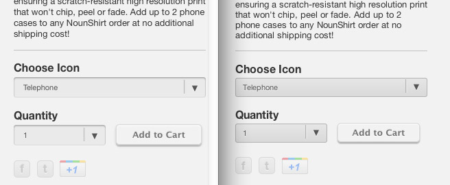
Forms on the Noun Project Store
In light of our last exercise on styling forms, I thought this was a nice example: The Noun Project is using CSS3 to add background gradients and shadows to their pop-up menus (aka selects). Notice that they are creating slightly different results in Safari and Firefox.
Follow the link and use your favorite web browser’s Inspector to see the CSS that accomplishes this.
