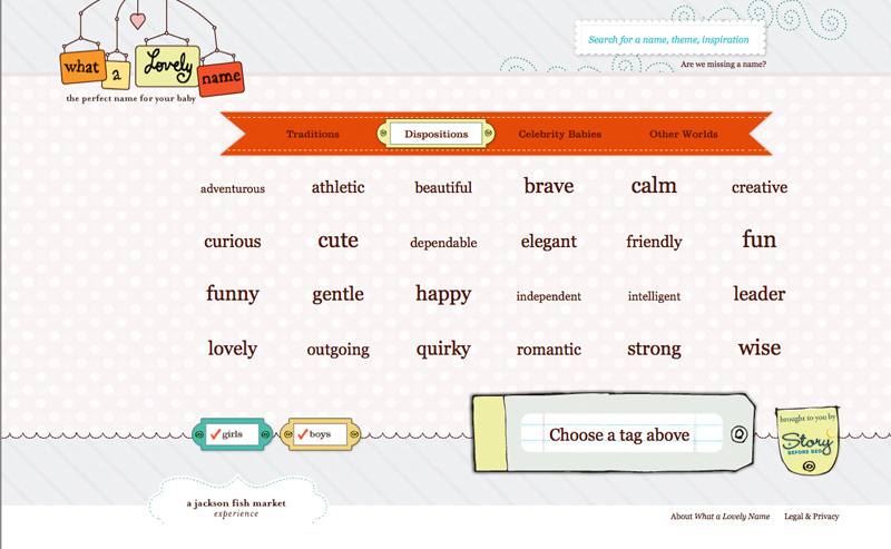
My favorite of the sites that I brought for show and tell is the site that helps you select a name for your child, create a custom logo and then sell you a bunch of stuff with that logo on it. The site is
What a Lovely Name.
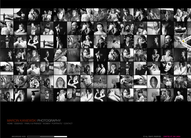
My next site was more difficult to navigate. It was a portfolio site for photographer
Marcin Kaniewski. I liked the ability to change the back ground color to black, white or gray.
I liked portions of the last two sites that I showed. On the site for
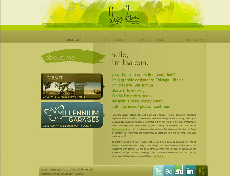
Lisa Bun, I like the way the links at the bottom looked and behaved.
On the site for the firm called
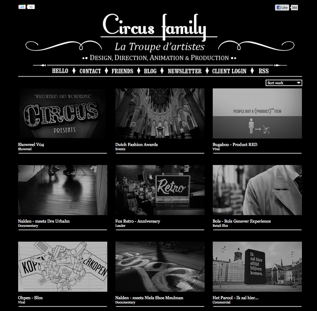
Circus, I liked the font combinations that they used.

 My next site was more difficult to navigate. It was a portfolio site for photographer Marcin Kaniewski. I liked the ability to change the back ground color to black, white or gray.
 I liked portions of the last two sites that I showed. On the site for Lisa Bun, I like the way the links at the bottom looked and behaved.
 On the site for the firm called Circus, I liked the font combinations that they used.
