Katelyn Joughin
Here are my websites from my show and tell.

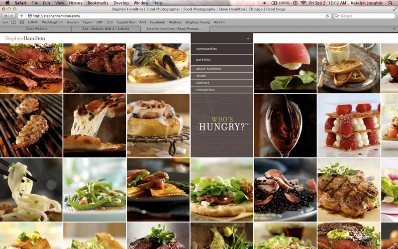
I liked this website Stephen Hamilton because of the way the portfolio was presented. I think it was very interesting and the huge photos were a plus!

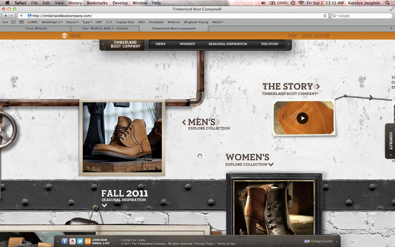
I thought this was a great interactive website Timberland Boot Company although, it had some major glitches. For example the mouse would disappear under certain images. It would be cool for a game interface, like moving around on a map, but for this reason it seemed like it didn’t belong

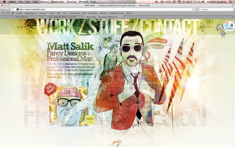
I liked this website Matt Salik, because of the way the portfolio was presented. I think it was very interesting and the huge photos were a plus!

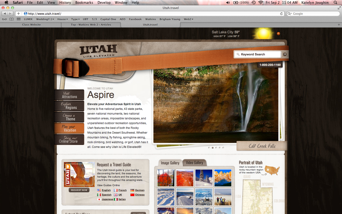
I thought that the website Utah Travel was great state website. It captured my eye and made me want to visit Utah. It was very user friendly with nice clean graphics.