James Muspratt
Jan 13
Web 3
A preliminary Web 3 website is now up. Come on over!
A preliminary Web 3 website is now up. Come on over!
This looks pretty great. Try doing the Javascript exercises right in your browser:
Hope you all are enjoying the winter break. I’ve just posted the syllabus for next semester — you can download it below. I look forward to seeing you in January!
Really cool realtime infographic using processing.js, HTML5 and canvas. It creates the visualization based on realtime tweets and separates them by country/language. You can click the blocks to view the tweets. I searched Christmas. You can search anything by changing the URL where christmas is to a new word.
Seems like CSS is progressing quite nicely. I'm sure most of these effects could be pulled off with other things such as javascript and php, but it's interesting that they're moving to CSS and becoming easier to achieve without knowing another language.This article talks about a variety of really cool new CSS3 filtering effects that make it more like photoshop. -webkit-animation combined with these filters presents some interesting new directions.
I ran across this article about web predictions. Seems responsive and mobile is going full steam.
Those of you interested in learning jQuery in more of a ground-up way (rather than cut, paste, and guess) should check out jQuery Fundamentals, an impressive one-page tutorial.
Not sure if anyone really checks this site after the semester/class is over, but I thought this was pretty interesting. It's a plug-in for Adobe Illustrator that allows you to export your vector drawings, bitmap images and animations as javascript for the HTML5 canvas element.
Web 3 will be a workshop-style class, meaning you will take on more of the definition of the scope and goals of your projects. That said, the exercises and projects will revolve around two topics:
The first emphasis will be on learning the fundamentals of Wordpress. While optimized for blogging, Wordpress can be used as a general-purpose Content Management System (CMS). Because it is fundamentally a collection of PHP files, you can mix in your own PHP alongside Wordpress’s built-in functions, variables, and looping structures. And, of course, Wordpress enables you to build a site that can be managed and updated by a client who has no knowledge of HTML.
We’ll use Wordpress to explore the contemporary notion of designing a system, rather than creating a static, one-time product. The site you build will require you to design and program templates, re-usable modules of code, and conditional rules that control the way elements (text, images, video) interrelate and combine. The rules may be simple or complex, but the outcomes they produce in the form of pages viewed at any given moment can be diverse.
The second emphasis (and project) will be in building a more experimental, free-form web site that visualizes a dataset or creates artwork in a dynamic way.
For inspiration we will be looking at work by the new generation of artist/programmers and studios like Jonathan Harris, Ben Fry, Aaron Koblin, Stewart Smith, and Lust. We will be exploring data structures like MySQL, RSS and XML, and the ways they can be manipulated with PHP.
For this project, invalid code and HTML hacks are encouraged.
If you need a break from project work, I highly recommend this 45 minute presentation by Jonathan Hoefler on H&FJ’s work and (slow) transition to web fonts. What’s notable is his overarching philosophy about ideas requiring an appropriate form to make them successful, and that this is true both in typography and in design in general.
I found these two sites interesting because they were creative and colorful websites. The illustrative qualities on the "Psyched" website was especially interesting.


It's a javascript library that uses HTML5 video to make videos on the web more like websites. I guess interactive videos on the web . Isn't that what flash was doing?
Click here for the site. 
Web design company from Nashville, TN. I wasn't really in to the design of their site so much, but they seem to utilize a lot of good practices as far as development goes. I don't get those long rectangular bars in the navigation.
This site didn't do much, but it was cool to see some HTML5 canvas in action.
This page is more about resource than it is about design. I do find the site works well. Basically 2 columns. I think the masthead/navigation is pretty sharp looking.
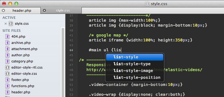
 If you’re feeling bored with Textwrangler and want to try a new text editor, take a look at Chocolat. It’s got the usual features plus another few: Dreamweaver-like code hinting, tabs, and a project drawer that just shows the files available in the current directory.
It’s free for now only because it’s still being developed (and might crash on you), so you’ll eventually have to pay for it. Still, worth a look.
Aaron Koblin shares some great experimental interactive (art) projects in his TED talk.
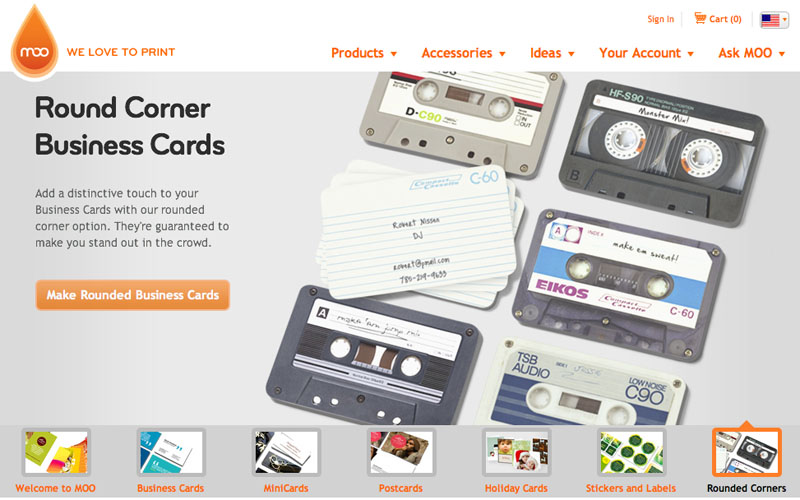
The first site that I showed in in class was a printing website called Moo. I thought it was interesting because it made use of php input fields to create business cards and also styled those input fields in interesting ways.
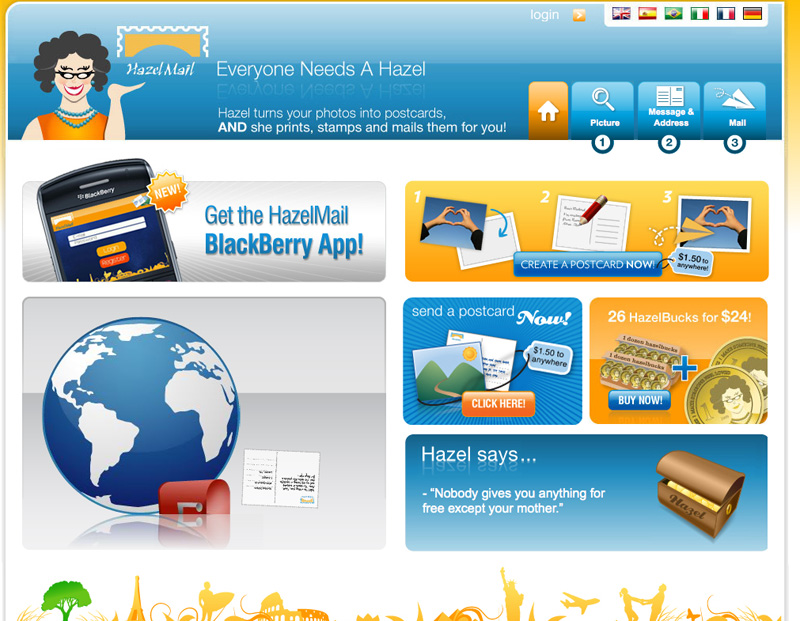
The second site that I selected is Hazelmail. It allowed you to updload your vacation pictures and create a postcard. It would then print it at the nearest printer and mail it for you. This was also an example of a site making use if php input fields.
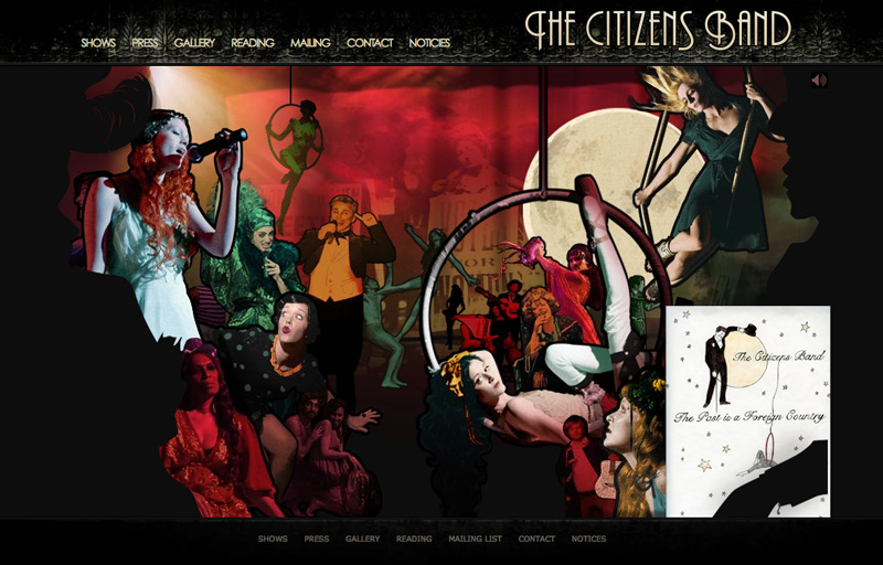
The third site that I selected did not deal with input fields. It is for the Citizen's Band. I brought it in because I like the action on the site and it seemed to related in a general way to things we are learning.
Pottermore
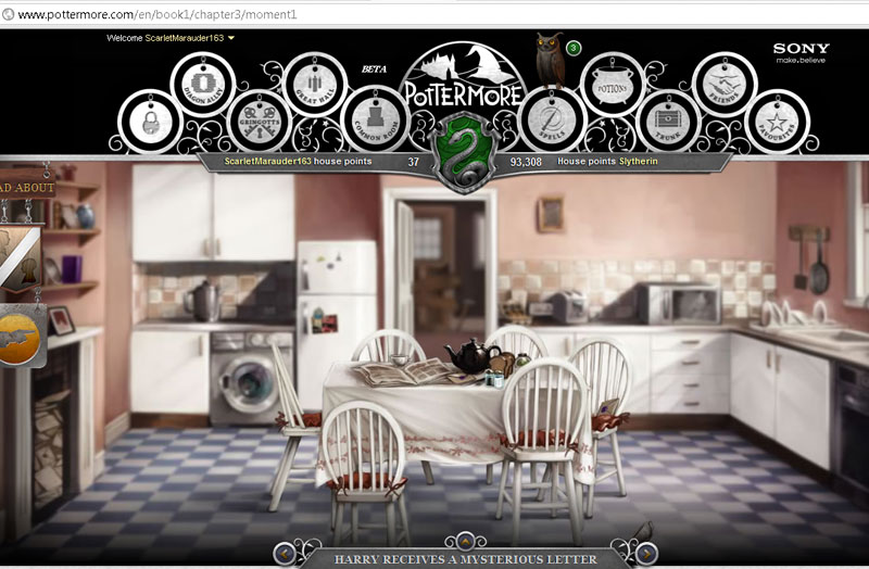
Pottermore is an interactive site for fans of the Harry Potter series. It contains interactive images so as to further immerse the user in the world of Harry Potter.
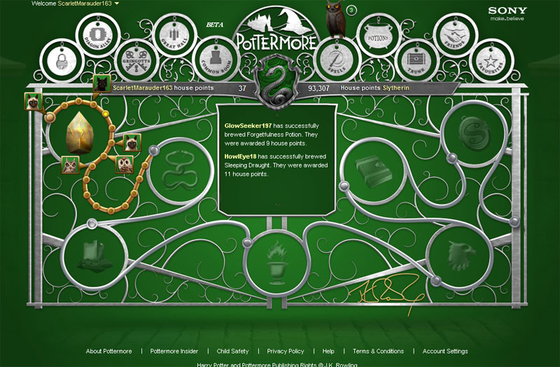
These interactive elements make Pottermore a wonderful website to explore, creating that sense of allure often found within the Harry Potter books.
Dynamit
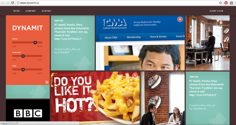
Dynamit had an interesting way of sorting through information. When you moused over their logo you could choose between more or less work, more or less company, or more or less now, which would reorder the boxes of information on the front page. The boxes of information was a flurry of information in different formats including photography, articles, video, and tweets.
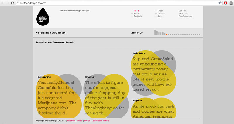
Method Design Lab
This is made to be a design-centric, user driven interface showing information relevant to the current time browsing. It shows innovation news around the web that was just published as well as giving options to see older news. The movement of the shapes that the news is displayed on makes it very interesting to watch.
Beautiful Explorer
This is a project showing what interesting things can be made using html5.
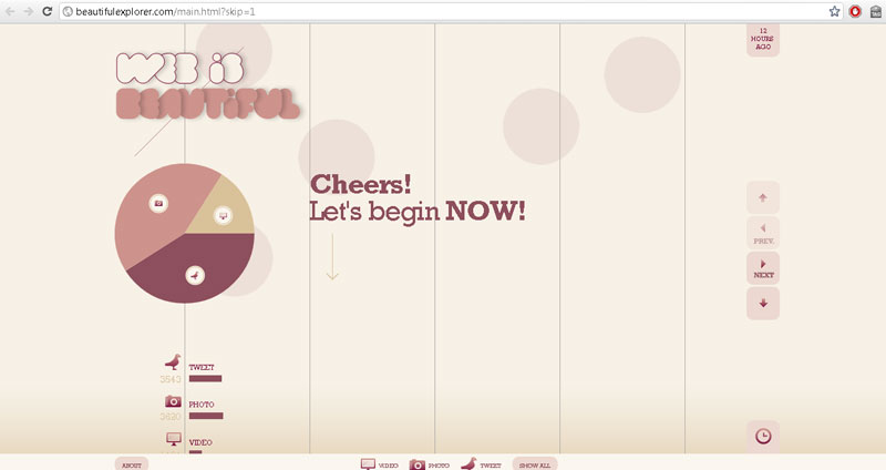
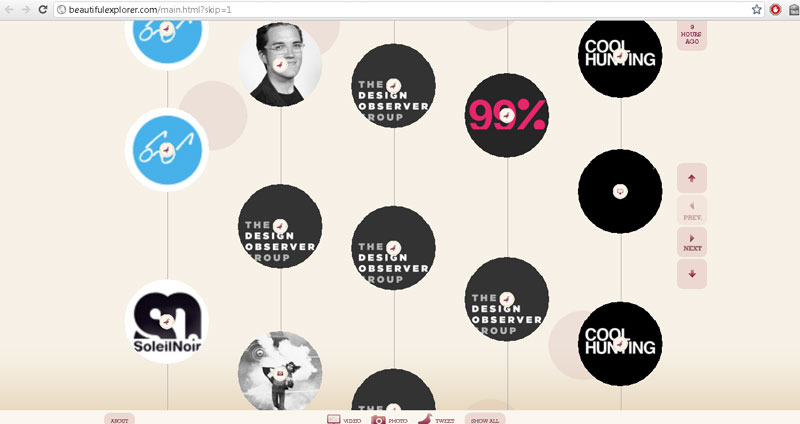
It shows tweets, photos, and videos in a scrolling interface that further loads content as you scroll down.
This is one of the sites I found when looking for steampunk themed websites. It transforms and stuff when you click the links. A really gimmicky site but I like a few elements, such as the way the lyrics are contained in a book, and the way the band bios are presented.


This site I found to be a much more efficient and simple design than the others. The steampunk aesthetic is more in the content than the design, but I think it still counts. Just another one of those let the work speak for itself things I guess, but it was executed in a nice way.


The final versions of both projects are due at 6pm on December 8th.
From the syllabus, here are the requirements:
If your name is Joe Schmoe, your projects should be accessible at the following addresses:
http://watkinswebdev.com/jschmoe/project1/http://watkinswebdev.com/jschmoe/project2/(Technically, the above URLs refer to directories, not documents, since they end in a slash. Make sure to name your home page index.php to ensure it loads by default). Whether you also want to link to these projects from you space’s home directory (http://watkinswebdev.com/jschmoe/) is up to you.
In order to get the required PHP includes and contact form working, you will need to be testing the site live on the server. Once again, please use all-lowercase file and directory names. (Very often the Mac filesystem will forgive case inconsistency as you develop locally, but a web server will not, causing your site’s links to break once you upload.)
Finally, please review the Project 1 details post for guidelines on file organization, image optimization, proofreading, typography, smart CSS, etc.