Watkins Web 2: Blog

Clearing floats: the Advanced Version

Most medium-complex sites involve floating elements to put them side-by-side. Often we want elements that follow floated elements not to be affected by them. Here are the top three ways to deal with clearing floats.

Using a dedicated .clear class

HTML

<p class="clear">Some text that follows some floats elements</p>

CSS

.clear {
	clear:both;
	}

Using a dedicated .clearfix class to make a container “self-clearing”

HTML

<ul id="gallery" class="clearfix">
<li><a href="#"><img src="image.jpg" alt="Image" /></a></li>
</ul>

CSS

#gallery li {
	float:left;
	}
.clearfix:after {
	content: ".";
	display: block;
	height: 0;
	clear: both;
	visibility: hidden;
	}

For those scoring at home, the idea is to use the :after pseudo-class to insert the period character (.), set it to display:block, clear any floats, and then hide that extra character. Clever.


Lindsey's Show-n-Tell-n-Click

Hello Giggles

giggle

A Monet Exhibition Site

monet

The Document Object Model

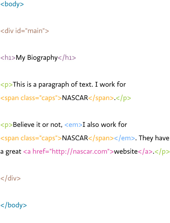
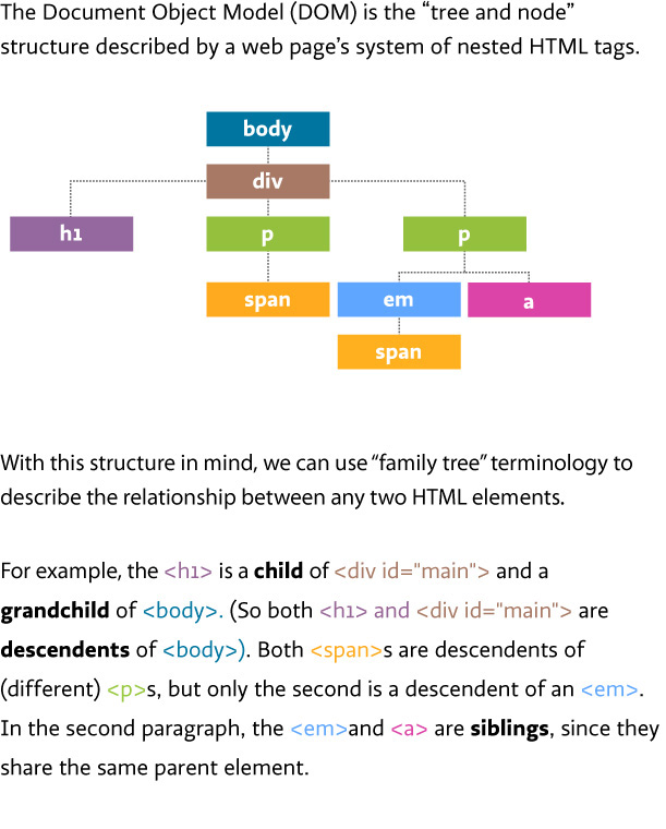
Whenever you hear about the “Document Object Model” (or “DOM”), it’s usually in the context of Javascript. But it actually applies to CSS, too, when you have to decide what kind of a selector to use. The diagram below shows how you might draw the structural relationship of a simple page, and therefore what relationship the individual elements have to each other.

Example web page

Document Object Model diagram 1

Page translated into a “tree and node” diagram

Document Object Model diagram 2

CSS selectors

This should help clarify some of the selector syntax we have been working with, and the situations that each is useful for:

/* Set every paragraph in Georgia */ 
p {font-family:georgia, serif;}
/* Create small-caps for every span that has a class of caps */ 
span.caps {font-size:.9em; letter-spacing:1px;}
/* Turn span text green, but only if the span is 
a descendent of emphasized text (here this rule will be applied 
to the second span only) */
em span {color:green;}
/* Italicize paragraphs that are the first child 
of the #main div (here this rule will be applied 
to the first paragraph only) */
#main p:first-child {font-style:italic;}
/* Put spans in bold, but only if they are 
children of paragraphs (here this will be applied 
to the first span but not the second) */
p > span {font-weight:bold;}

Further Reading

Kasteelbier - Kelsey's Show & Tell

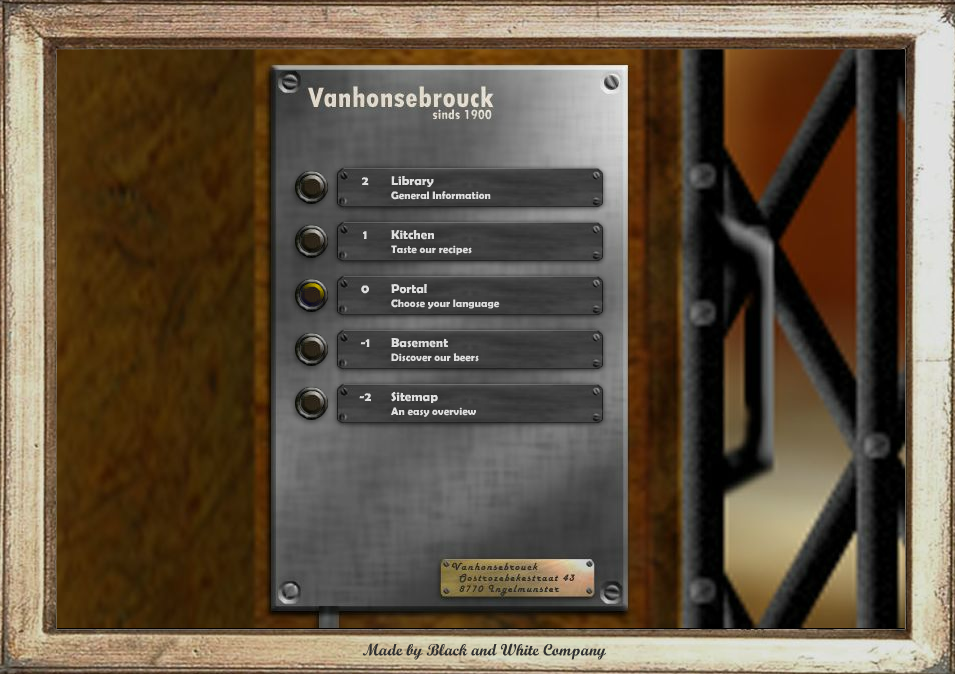
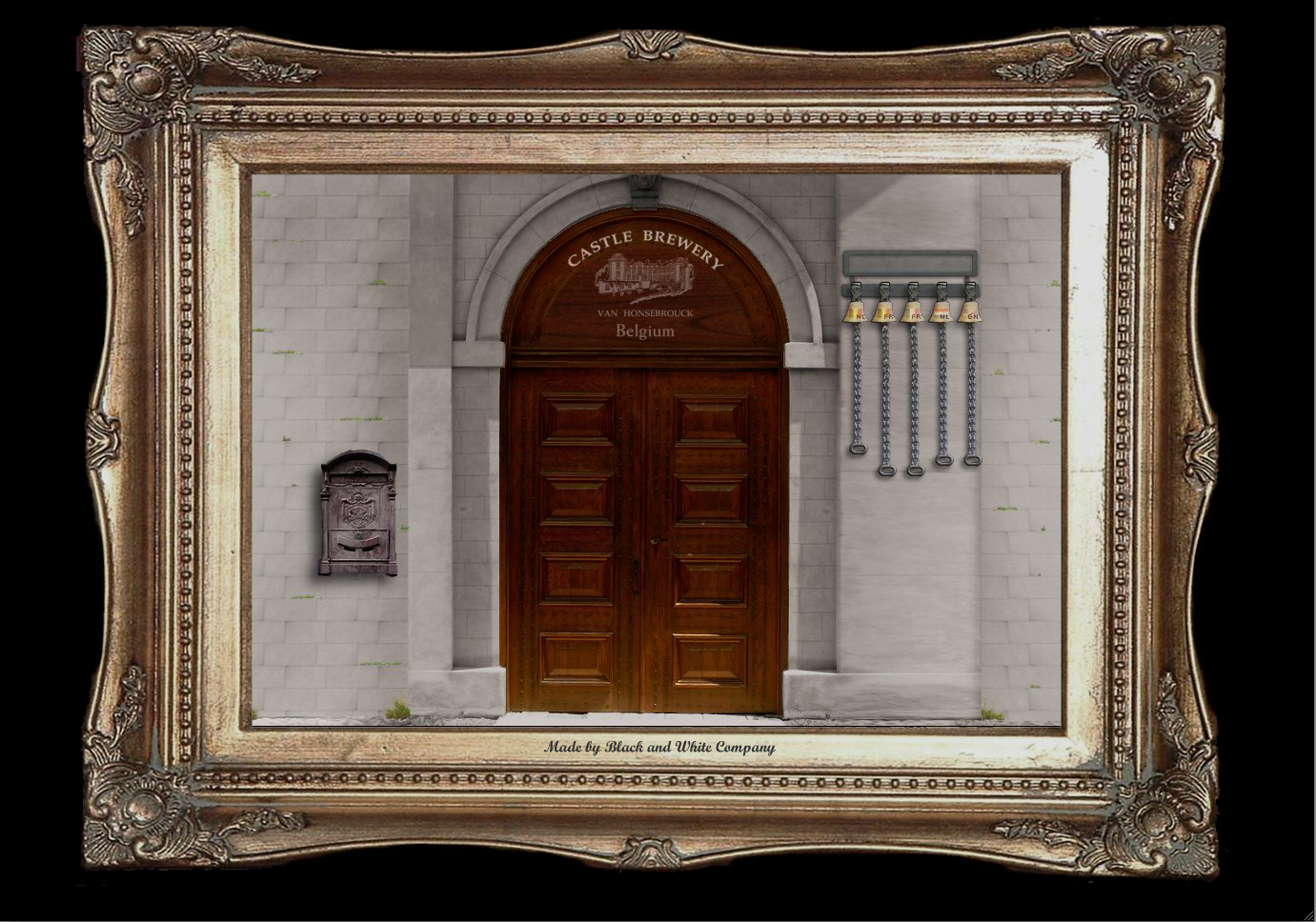
I thought this brewery's website would be interesting to share. It surprised me how much a company like this would put so much effort into such an interactive website.

intro

door

kitchen

Bostonglobe.com

Boston Globe redesign

Remember responsive design from last semester — the combination of percentage-based layout, scalable images, and media queries that lets pages adapt fluidly to the browser/device width?

Yesterday a new Boston Globe website was launched “for all devices”. I think it’s probably the largest responsive website designed to date. It was created primarily by design studio Upstatement and the developer shop Filament Group, with help from Ethan Marcotte, the designer/developer largely responsible for the term and many of the ideas behind “responsive web design.”

Check out the blog posts from Upstatement, Filament Group, and Ethan Marcotte.

Think Tank is this Saturday

You should all consider attending Think Tank Nashville, the one-day conference this Saturday. There’s a great line-up of speakers, including Raphael Grignani from Method.

It’s September 17 at Rocketown and costs $50 for student AIGA members.

jquery

Here is a JQuery How To site with some basic JQuery stuff on it. Like commenting out a line.

Atrian's Show and Tell

I enjoyed the following two websites for their innovative design styles.


DontClick.It


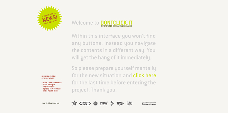
Don’t Click It used an innovative navigation style that utilized a hovering based selection over clicking. It was interesting how it managed to allow the user to maneuver with hovering while still making sure the the user wanted to go to the next page.


dontclick.it opening page

dontclick.it main page

Saab Saibu Tour

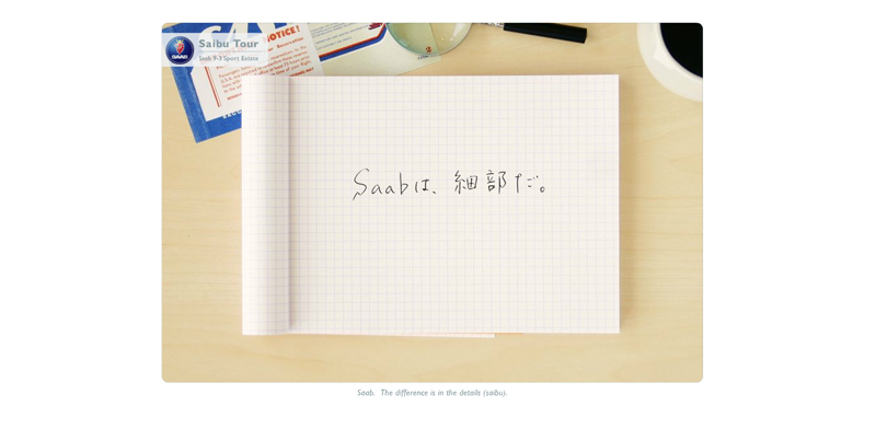
The Saab Saibu Tour was a flash site the used an interesting interactive commercial design that allowed the user to tour a car commercial while remaining somewhat in control.


Saab opening page


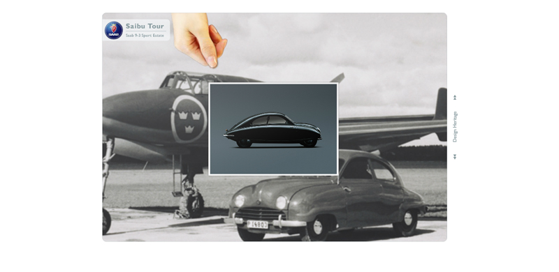
The slideshow of Saab cars over time was particularly interesting.


Saab image slideshow

Exercise 10: jQuery

Download Exercise 10

The instructions are in the HTML file. This is mostly a tinker-and-see-what-happens exercise, so there is no separate solutions file.

Further Reading

Exercise 9: Navigation Bars

Download Exercise 9

Update (Dec 1, 2011): The solution is now included in the files.

Further Reading

Katelyn Joughin

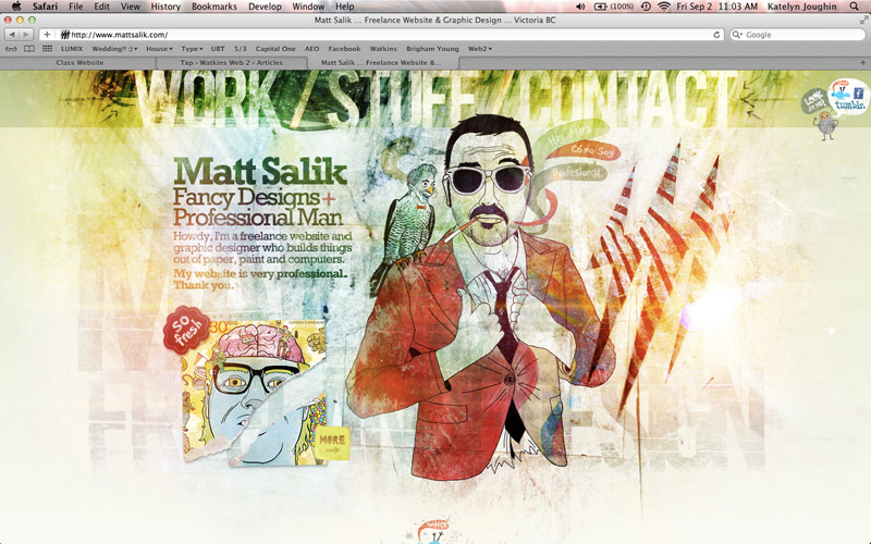
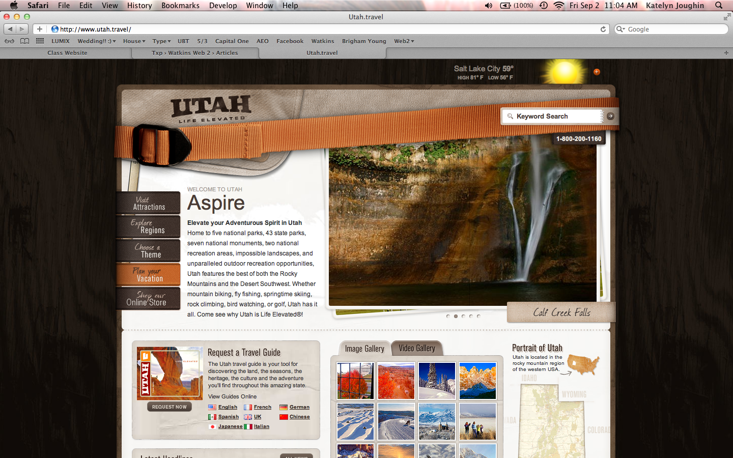
Here are my websites from my show and tell.

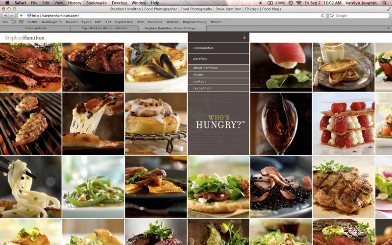
I liked this website Stephen Hamilton because of the way the portfolio was presented. I think it was very interesting and the huge photos were a plus!

I thought this was a great interactive website Timberland Boot Company although, it had some major glitches. For example the mouse would disappear under certain images. It would be cool for a game interface, like moving around on a map, but for this reason it seemed like it didn’t belong

I liked this website Matt Salik, because of the way the portfolio was presented. I think it was very interesting and the huge photos were a plus!

I thought that the website Utah Travel was great state website. It captured my eye and made me want to visit Utah. It was very user friendly with nice clean graphics.

Exercise 8: Modular Grids with CSS

Download Exercise 8

The grid in this exercise was adapted from the 960 grid system. When you get a chance, you should take a look and download the template files from there, too. Of course you may well prefer to construct your own grid for your project.

Here’s a brief description of the concept going on here: Very often we want to crate a grid-based design, where the content is structured with a system of columns and subdivisions. Each div (or list, or paragraph) will be a certain number of grid “modules” wide. So instead of specifying the pixel width we want for every element using IDs and CSS, we define a system of width classes (.w1, .w2, .w3 ….) that match our module widths. Then we apply them to each HTML element we want to control. We also define two float classes (.left and .right) and use these in conjunction with the width to control the layout. A two-column div that needs to be floated right would then just get the two corresponding classes: <div class="w2 right">bla bla</div>. A 1-column div that needs to be floated left would look like this: <div class="w1 left">Bla bla</div>.

In general we don’t want to go too crazy with this system and apply width classes to every single element. But it’s definitely useful for the primary containers on a page.

Update: Solutions are now included with the files.

Review: Classes, IDs, Selectors

For your reference I’m reposting this guide from the Web 1 blog:

Classes vs. IDs

Classes and IDs should first be understood as attributes that you add to HTML entities – they just happen to be particularly useful as targets of CSS selectors. So you might change <p>Some content</p> to <p id="footer">Some content</p> so that you can style it a particular way.

The point of IDs is that they are unique identifiers for a particular HTML entity. Therefore, they only be used once on a page. If you want to create a set of things to be styled the same way, use a class: you could have <p class="infobox">Welcome to my site</p> near the top of the page and then <p class="infobox">Check out my other website...</p> further down the page.

CSS Selectors

Pay careful attention to the use of spaces: they indicate a descendent selector. p#special refers to the HTML element <p id="special">, but p #special (with a space after the p) refers to “anything with an id of special inside a paragraph.” For example, the span inside <p>Some content <span id="special">some nested content<span></p>

This table summarizes the most common ways to style elements using IDs, classes, and descendent selectors:

What we want to style HTML CSS Rule
All paragraphs <p>Sample</p> p {color:red;}
All paragraphs with a class of special <p class="special">Sample</p> p.special {color:red;}
The (only) paragraph with an id of first <p id="first">Sample</p> p#first {color:red;}
Anything with a class of warning <p class="warning">Sample</p>, but also <ul class="warning">, <div class="warning">, etc., if they exist. .warning {color:red;}
Paragraphs nested inside the maincontent div <div id="maincontent"><p>Sample</p></div> div#maincontent p {color:red;}
List items nested inside unordered lists that have a class of ingredients <ul class="ingredients"><li>Sample</li></ul> ul.ingredients li {color:red;}

Exercise 7: Aligning Type to a Baseline Grid

Download Exercise 7

Further Reading

Demo: htaccess, server paths, relative vs. absolute

Please download the files to your desktop.

Update: Here are some more resources on using .htaccess to reconfigure server behavior:

Quiz: Markup, Selectors, Layout

Part 1: Markup

  1. Circle the markup that would definitely throw a validation error (i.e. you know it’s wrong without needing to see the context in which it appears):
    1. <a id="home link" href="home.html">Home</a>
    2. <li class="item" id="item">A gallon of milk</li>
    3. <h1><strong>My Page<h1></strong>
    4. <img src="photo.jpg" />
    5. <a class="outbound-link news" href="http://nyt.com">New York Times</a>
    6. <h2>Welcome to this <span>Site</span></h2>

Part 2: Selectors

Suppose the following markup appears on a page:

<body>

<div id="wrap">

<h1>My awesome page</h1>

<ul id="nav">
<li><a href="index.html">Home</a></li>
<li><a href="work.html">Work</a></li>
<li><a href="about.html">About</a></li>
</ul>

	<div id="main">
	<p>My name is Joe. I love design.</p>
	<p>When not working for the <span class="caps">CIA</span>, 
		I do <a href="work.html">design work</a>.</p>
	</div> <!-- /main -->

	<div id="sidebar">
		<h2>Useful Links</h2>
		<ul>
		<li><a href="http://joeschmoe.com">Joe Schmoe</a></li>
		<li><a href="http://pentagram.com">Pentagram</a></li>
		<li class="edu"><a href="http://watkins.edu">Watkins</a></li>
		</ul>
	</div> <!-- /sidebar -->

</div> <!-- /wrap -->

</body>
  1. Circle the CSS selector(s) that would successfully target the hyperlinks inside the navigation list and no other links on the page.
    1. ul a
    2. #nav li a
    3. ul li a
    4. ul#nav a
  2. What CSS rule(s) would successfully render “CIA” in small caps?
    1. span#caps {letter-spacing:1px; font:.9em;}
    2. span.caps {letter-spacing:1px; text-size:.9em;}
    3. #caps {letter-spacing:1px; size:.9em;}
    4. .caps {letter-spacing:1px; font-size:90%;}
  3. Circle the CSS declaration(s) that would successfully add top and right margins of 10px each to the targeted element.
    1. margin:0 10px;
    2. margin:10px 10px 0 0;
    3. margin-top:10px; margin-right:10px;
    4. margin:10px 0;
  4. Circle the CSS rule(s) that would successfully add a gray background to the unordered list in the sidebar and inset the text from its edges (so that you can see gray all around the text).
    1. #sidebar ul {background-color:gray; padding:10px;}
    2. ul#sidebar {background-color:gray; padding:10px;}
    3. #sidebar h2 ul {background-color:gray; padding:10px;}
    4. ul #sidebar {background-color:gray; margin:10px;}

Part 3: Layout

Let’s say we want to make main a 400px-wide column on the left and a 300px-wide sidebar to its right, with everything sitting on a gray background.

  1. Circle the CSS rule(s) that would successfully put the “Useful Links” all on a single row, next to each other.
    1. #sidebar ul {list-style:none; float:left;}
      #sidebar li {float:left;}
    2. ul#sidebar ul {list-style:none;}
      ul#sidebar li {display:inline;}
    3. ul .sidebar {list-style:none; float:left;}
      ul .sidebar li {float:left;}
    4. .sidebar {list-style:none;}
      ul li.sidebar {display:inline;}
  2. Circle the rules that — working together — would achieve this layout using the “Opposing Floats” technique.
    1. #wrap {width:700px; background-color:gray;}
    2. div#wrap {width:700px; float:left; background-color:gray;}
    3. div .wrap {width:400px; background-color:gray;}
    4. #main {width:400px; float:left;}
    5. .main {width:400px; float:right;}
    6. #sidebar {width:300px; float:right;}
    7. .sidebar div {width:300px; float:right;}

FTP

Here’s a quick overview of FTP. Dreamweaver has FTP built in:see the Files palette. For freestanding FTP clients on the Mac, I recommend Panic’s Transmit ($34). The best free option appears to be Cyberduck, though its interface is a little clunky.

In general with FTP you have to fill out a bunch of fields correctly to connect to the server successfully. Almost all are case-sensitive, and it’s common to just make everything lower case for simplicity.

Lets review the settings assuming your name is Joe Schmoe:

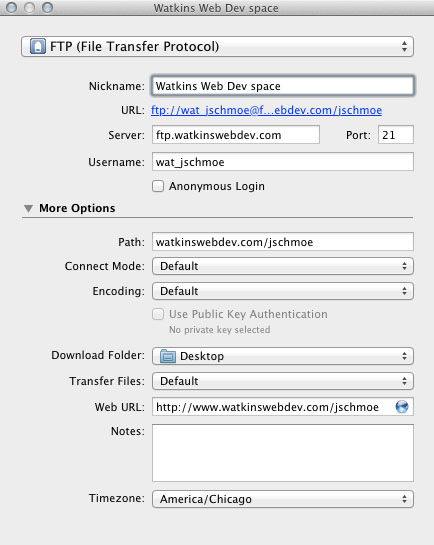
Name: My Watkins web space
This is just a nickname for your own reference. Be descriptive.

Protocol: FTP
Stands for File Transfer Protocol. The most common alternative is sFTP: it’s much more secure and you should use it when you can. But our provider (Dreamhost) uses FTP.

Server: ftp.watkinswebdev.com

Username: wat_jschmoe

Password: [you got this in class]

Port: 21
Rule of thumb: FTP requires Port 21. sFTP requires Port 22. For what it’s worth, all internet traffic is sent through a port: the world wide web itself usually uses Port 80. See the Wikipedia article on port numbers for more.

Remote Path: watkinswebdev.com/jschmoe
This simply tells the FTP client to jump directly to a particular sub-folder on your server as soon as it connects (so as to save you clicking). On watkinswebdev.com we need to jump two levels down until we get to the folder that contains your “root” folder. If you sign up for hosting yourself, you might well need to use a Remote Path that looks like jschmoe/web/public/. The point is that the particular folder structure on the server usually looks a little different from the web URL structure. But once you figure out what the “root” folder is, it makes sense: Putting a file called page.html in watkinswebdev.com/jschmoe means it will be available at http://www.watkinswebdev.com/jschmoe/page.html.

Update: for your reference, here’s about what your FTP settings should look like you’re using Cyberduck:

FTP Settings

Exercises 4-6: Floats, Positioning, and Faux Columns

Download Exercises 4-6

Update: Solutions are now included in the .zip.

Zeldman: The Web Comes of Age

Godfather of the web Jeffrey Zeldman gave the keynote in June at the Design It. Build It. Conference. It’s about an hour long and definitely worth a watch:

Jeffrey Zeldman – The Medium Comes of Age from Codeworks Ltd on Vimeo.

Exercises 1-3: Selectors, Box Model Review

Download Exercises 1-3

8/24/11 Update: I’ve fixed my typos and added solutions to the zipped file. Please re-download if you’re collecting these files for reference.