Watkins Web 2: Blog

HTML5 for Web Designers

HTML5 for Web Designers book cover
Wow, you can now read the entirety of Jeremy Keith’s HTML5 for Web Designers for free online.

I recommend the last chapter, Using HTML5 today, in particular. It’s also worth taking a look at the way Keith has marked up the pages themselves. View source!

Forms on the Noun Project Store

In light of our last exercise on styling forms, I thought this was a nice example: The Noun Project is using CSS3 to add background gradients and shadows to their pop-up menus (aka selects). Notice that they are creating slightly different results in Safari and Firefox.

Follow the link and use your favorite web browser’s Inspector to see the CSS that accomplishes this.

forms styled with CSS3: Safari vs. Firefox

Advanced Forms and Attribute Selectors

Download Exercise 15

Update: A solution is now included with the files.

Fun facts about forms

  1. A form is first-and-foremost defined by the elements between <form> and </form> tags. There might be many text fields, radio buttons, and checkboxes, but if they all appear inside a single set of <form> tags, that’s one form.
  2. Forms usually have at least two attributes, called method and action. The two options for method are get and post, and the action specifies a file to process the form when it gets submitted. So usually we’ll write something like <form id="contact" method="post" action="email-sender.php"">. We’ll go over these details later.
  3. Most form elements are inline by default, and inline HTML elements need to be contained by block level elements to be valid. This is why you see so many pointless-looking <div> tags in forms.
  4. The most common form elements — text inputs, textareas, and submit buttons — require illogical-looking markup. Pay special attention to the type attribute whenever you see an input:
    Form element Markup Output
    A single-line text field <input type="text" />
    A multiline text area <textarea rows="5" cols="20">I suppose some placeholder text could go here, but most people leave it out.</textarea>
    A “submit” button that sends a form <input type="submit" value="Submit Form!" />

Further Reading

Show and Tell

Agent 8 Ball

I thought the Agent 8 Ball site was interesting because it is an interactive game developed through javascript and utilizing the HTML5 canvas tag. It looks and acts much like a Flash game without using flash.

agent 8 ball screenshot

Cultural Solutions

This is one of the sites that I had to pull up at the last minute because I left my sites at home. I showed this site because it utilized some new HTML5 techniques. The site had a nice layout, but it wasn't incredibly impressive

cultural solutions

Nakshart: Geolocation

I choose to show this site because it utilized the HTML5 geolocation tag. I believe it also used the canvas tag with javascript. I thought this site was quite interesting, but it didn't seem to work perfectly well. Perhaps it needs some more tweaking.

geolocation site

Effect Games: Canvas Demo

This site again used the HTML5 canvas tag to create animated images. I liked this site because I'm a sucker for pixel art and animation.

pixel animation

Katelyn Pennington

Here are my websites from my show and tell.

I liked this website Pandr because the colors were great! I liked the way the top of the page stayed the same but featured different items. I also liked the clean and simple style.

I really liked the way Corey Made used all one page with his links that navigated down the page instead of to many different html pages. I really like the presentation of his work.

Unfold was the most unique website I have ever seen. I thought the layout was so interesting. I feel that some users would get lost but the concept was very cool. It still boggles my mind as to how they rotated those images but I think it is great!

Intro to The Shell

The Mac’s Terminal.app program lets you control the system with text commands, sort of like DOS before Windows arrived. Technically you’re using this interface to interact with Mac OS X’s Unix underpinnings, bypassing the graphical user interface entirely. (Unix is an open-source operating system that dates back to the 1970s: many present-day operating systems are built on top of it, including Mac OS X and  the various kinds of Linux, some of which run on personal computers and others of which run on web servers). Apache is a web hosting program that runs on Linux. Windows is not Unix.

Terminal’s text-only environment is variously called “the terminal,” “the command line,” “the shell,” and bash (short for “Bourne-again shell” — don’t ask). In general, you can use the shell to run scary system-level scripts, monitor system processes, log into other computers or remote web servers, etc. Serious nerds even edit text files with shell programs like Vim, Vi, or Emacs.

The first thing you’ll notice about the shell is its limitations: you have to use the arrow keys to move around, you can’t select text and delete it, you can only clear a line you’re writing with [ctrl] c, etc. Try exploring with the commands below.

Important Commands

Command Description
pwd Path of working directory
Outputs the current folder you’re in
ls List files
Shows all files and folders in the current working directory
clear Clear
Clears the screen
cd foldername Change directory
Moves you into a different directory. Use cd.. to go up a level. You must “escape” spaces with a forward slash: cd My\ Folder. Note that you can drag a file or folder from the Finder right into Terminal and it will insert the corresponding file path instantly.
cp filename.txt filename2.txt Copy
Copy a file — you must provide both the original and new file names, separated by a space.
mv filename.txt path/to/folder/ Move
Move a file — you must provide the file name and a destination directory, separated by a space.
mkdir foldername Make directory
Creates a new folder
curl http://website.com Client for URLs
Scoops the HTML source of a webpage and outputs it
banner word Banner Text
Outputs ridiculous sideways ascii art of word
[ctrl] c Cancel
Clears the line that you’re writing
Up arrow
Shows previous commands. Keep hitting ↑ to go further back in your history and ↓ to go forward.

Further Reading

Project 1 Details

I hope you all are doing well with Project 1. To summarize, Project 1 is due at the beginning of class on Thursday, October 13. Please be ready to copy your files to the Flash drive that I will pass around.

Here’s a quick housekeeping checklist (these are required):

  • All your files must be in a single folder (named lastname-project1) which contains only the files necessary for your site. No old drafts, no PSDs, no PDFs: just .html, .css, and .js files plus your images. You’re free to organize these into folders however you like; just make sure your href and src attributes are written as relative paths to their corresponding page (e.g. <img src="images/poster1.jpg" />).
  • All your filenames must be all lowercase
  • Your home page file must be named index.html
  • Your pages must be primarily driven by a single stylesheet (the acceptable exception would be extra lightbox or slideshow stylesheets that work in addition to yours)  
  • Images must be properly optimized. Rectangular images that don’t need transparency should be saved as JPGs with a quality setting of 70-80. Images that require transparency should be saved as PNG-24. 

And here are the content requirements from the syllabus:

  • Your site must contain a gallery of art/design work, your contact information, and a short bio. Additional content might include an artist’s statement, a résumé, writing samples, a links/inspiration page, and/or a client list.
  • You are also free to incorporate dynamic embedding (Flickr photos, Twitter feed, etc) if that content makes sense as part of your concept and can be thoughtfully integrated.

Design Considerations

Typography

Make sure to give your project a typographic audit: first and foremost, proofread your text. Then take a look at the finer points: do your quotation marks on block quotes hang in the margin? Do drop-caps line up with their baseline, and have small caps been used if appropriate? Have you used the correct HTML entities for quotation marks, dashes, ellipses, etc.? Remember you can speed up this process by running your text through Textile.

Grid System

Most of you are using a grid system to organize your content into a system of columns that have a mathematical relationships. Try checking your grid alignments by taking a screenshot of your web page and then bringing it into your Photoshop mockup.

Code Considerations

Validation

Please validate your HTML and CSS. You need not use perfectly valid code (especially if employing CSS3 properties or pulling in external content), but none of your errors should come from unclosed tags, missing alt attributes, or CSS syntax errors.

Markup

Strive to use semantic — not presentational — markup. This fundamentally means using the right HTML tag for the content you are marking up. Your primary “vocabulary” for your text content includes h1-hn headings, paragraphs, lists, and blockquotes. For example, navigation links are traditionally marked up as an unordered list (<a>s nested in <li>s nested in a <ul>). If using HTML5, you’ll want to wrap this list in a <nav> tag as well.

In addition, although the browser can’t understand them, you should be preferring semantic class and ID names, too: main, intro, caption, gallery, subnav all describe what the content is, not how it will look when the stylesheet is applied. If your pages are filled with names like bluebox, largetext, or indented, you should go back and reconsider them.

Smart CSS

This project is an opportunity to practice using efficient CSS. Make use of the descendent selector (ul#nav a) rather than putting a class or ID on every element. Apply classes and IDs to your primary content containers so that you can target the contents of each one selectively. Remember that you can apply the same set of rules to multiple elements using a comma (#main ul, #sidebar ul). Take a look at the Document Object Model the Review of Classes, IDs, and Selectors posts as reference.

“Bulletproofing” Your Site

We’ve talked about the principals of “progressive enhancement,” “graceful degradation,” and the philosophy of developing “mobile first”. These are largely interrelated ideas: our stylesheets and javascripts should always be written in ways that anticipate non-ideal conditions: small screens, slow connections, old browsers, or lack of Javascript support. Here are some good habits to help make this happen:

  • If possible, don’t specify heights on the primary containers in your pages (usually divs): it’s better to let the content itself expand the box — that way you can add more content later without updating the stylesheet, or even recycle the same div and ID on subsequent pages that contain different amounts of content. Use padding on the content to create space inside the container, and margins on the individual elements to create space between them.
  • Stress-test your pages by resizing the text up and down a few times. (Make sure to check View > Zoom Text Only) in your browser. If the layout breaks, you may be able to improve the page by specifying fewer widths and heights on your containers.
  • When styling links as buttons, use padding in combination with display:block; so that your clickable area include the entire button, not just the link text.
  • When floating elements, you almost always need to specify widths. If the floats are interfering with the content that follows them in the markup, use the clearfix trick on the container of the floats.

Good luck!

Xavier's Show and Tell

I know I'm really late but here is my show and tell.
First is The site fir Interview Magazine. I really liked the little touch of having the "hanging tab" as you scroll down.
Visit Site

Second is AgencyNet.com, a really cool Flash site for a creative company.

Jill's show and tell

My favorite of the sites that I brought for show and tell is the site that helps you select a name for your child, create a custom logo and then sell you a bunch of stuff with that logo on it. The site is What a Lovely Name. My next site was more difficult to navigate. It was a portfolio site for photographer Marcin Kaniewski. I liked the ability to change the back ground color to black, white or gray. I liked portions of the last two sites that I showed. On the site for Lisa Bun, I like the way the links at the bottom looked and behaved. 
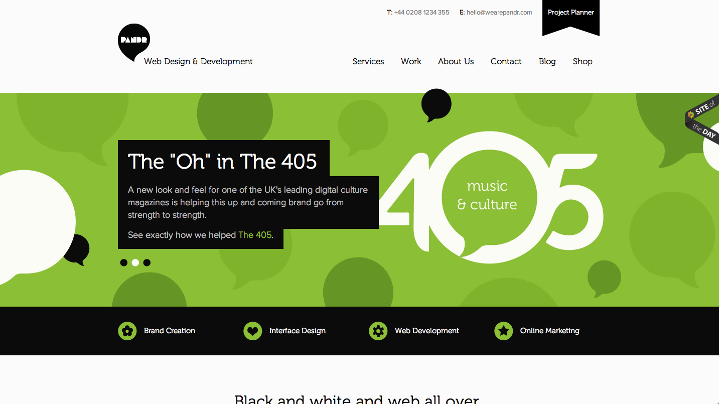
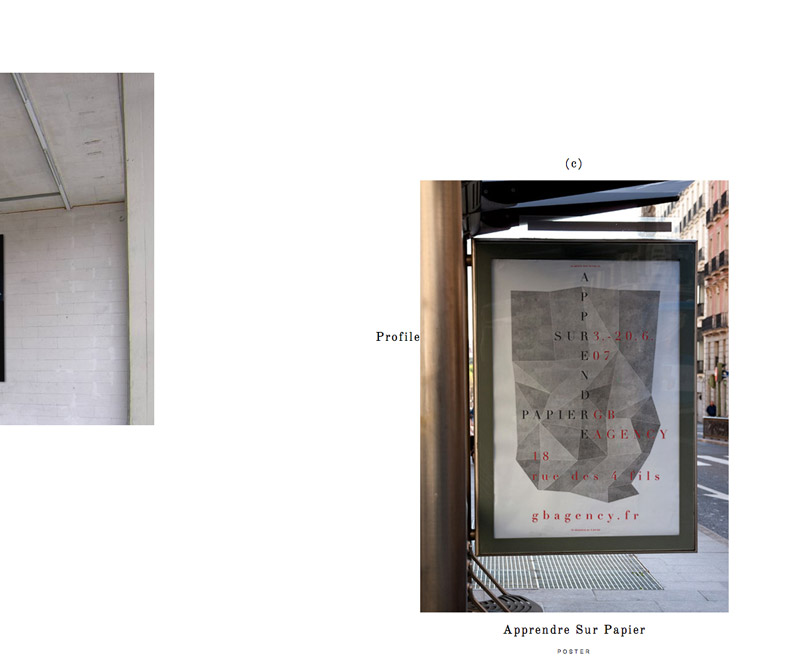
On the site for the firm called Circus, I liked the font combinations that they used.

Responsive Media

Here are two resources I’ve found useful in making responsive designs recently

  • Flexslider is a jQuery plugin that turns an unordered list of images into a “carousel” or simple cross-fading slideshow. It’s very similar to the Cycle plugin, except that it manages responsive images much better: just leave the height and width attributes off your <img /> tags, set them to max-width:100% in your CSS, and they’ll work as they should.
  • Elastic Videos shows you how to embed Youtube videos so that they, too, can resize with the browser.

The Frist Center For The Visual Arts

The Frist site is clean and responsive. Easy to navigate.

Clean, responsive design

Island Creek Oyster Bar

another clean, no flash site

A great site with no flash.

Oat, the design company of Island Creek Oyster Bar

A clean, flash free site

Exercise 14: Responsive Design

Download Exercise 14

Update: a solution is now included with the files.

Open page outline.txt, index.html, and style.css and examine the code to see how the basic structure is set up. As you review the CSS file, note the three canonical features of a “responsive design”:

  1. The main container (#container) is only restricted by a max-width property, meaning it can contract to a smaller width when the browser window gets skinnier than 1200px.
  2. Images on the page do not have width and height attributes. Instead, CSS is used (max-width:100%) to allow them to scale down with their container. Using max-width instead of width ensures that the images will never be scaled up and get pixellated.
  3. Finally there are two media queries set up to detect when the browser becomes “medium-wide” (600 – 999px) and “wide” (1000px – 1200px). These contain distinct rules that supplement or override the primary rules above them in the stylesheet.

Your task is to find all the instances of PERCENT and choose replace them with actual percentage values that will make the page lay out differently for medium and wide screens. The medium layout should use two columns, while the wide column should use three.

Further Reading

  • Responsive Web Design, Ethan Marcotte’s article that kicked the movement off.
  • Responsive Web Design, Ethan Marcotte’s book. $9 for the ebook.
  • Media Queri.es, a website showcasing sites built with responsive designs.
  • Mobile First, Luke Wroblewski’s manifesto that we should build our sites to work well on mobile platforms first, then progressively enhance them to work on desktop browsers.

Exercise 13: HTML5 Video

Download Exercise 13

Important: Serving video on a live web server

If posting to a server, your videos probably will not play unless you add this to your .htaccess file:

AddType video/ogg .ogv
AddType video/mp4 .mp4
AddType video/webm .webm

Further Reading

Codecs

  • Handbrake, Mac software useful for encoding video as h.264 .MP4s.
  • Firefogg, an awesome Firefox extension that will convert your video to the ogv format.

Furthermore

Scrolling and Typography

2011 Beercamp

The pages move towards you when scrolled

Buero-Buero

The images move in 4 directions when scrolled

NetMagazine

This falls under user choice, list or grid format

Mr Doob

Flash Experiments

Lost World's Fairs

Typography set with CSS

this might be elementary... but i had to share

CSS Cheat Sheet

Aaron's Cool Story

Design Fighter

This is a site a friend of mine made a couple years back for his senior portfolio show. It is bases on arcade style fighting games. Unfortunately the site was only up for a while, but I have a copy on a disc.

Chiptune.com

This is another site style after a retro interface. In this case it’s about 8-bit music. Unfortunately too much creative styling can make a site hard to navigate.

http://www.chiptune.com/

Exercise 12: Conditional Comments and Basic HTML5

Download Exercise 12

Your task is edit html5.css so that html5.html and xhtml.html look exactly the same in the browser: to do so you’ll have to change the selectors in html5.css to correctly target the newer HTML5 tags being used in html5.html.

Exercise 11: Translating PSDs to Markup + CSS

Download Exercise 11

Tonight the primary goal will be to translate the PSD pages into valid and semantic HTML: don’t even worry about the CSS yet. That said, you’re welcome to create IDs and classes in the HTML (e.g. <div id="maincontent">) that you’re pretty sure you will need when you get to the CSS.

Please do not try to implement a module system for this exercise: just use semantic class and ID names and attach them to your <div>s, <span>s, <p>s, <h1> - <h6>s, <ul>s, etc.

Update: A solution with both HTML and CSS is now included with the files.